
About
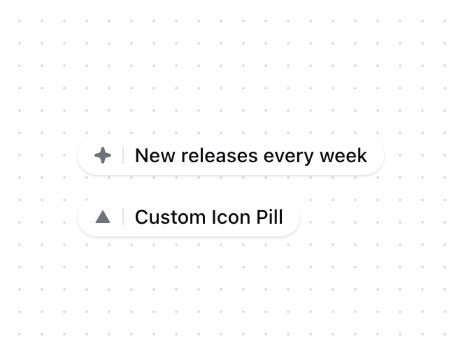
A pill-shaped component for highlighting key features or messages with optional icons and animations. Features - Optional leading icon - Smooth entrance animation - Dark mode support - Customizable styles and animations - Hover effects
Built with React and Tailwind. Copy the prompt and paste it into Claude Code, Cursor or Lovable: your agent adds Hero Pill to your project and fits it to your theme.
Code
How Hero Pill is used: the demo's code. The component's own source comes with a free account.
Usage.tsx
import { HeroPill, StarIcon } from "@/components/ui/hero-pill"

function HeroPillDemo() {
  return (
    <div className="space-y-4">

      <HeroPill
        icon={<StarIcon />}
        text="New releases every week"
      />

      <HeroPill
        icon={
          <svg
            xmlns="http://www.w3.org/2000/svg"
            width="12"
            height="12"
            viewBox="0 0 24 24"
            className="fill-zinc-500"
          >
            <path d="M12 2L1 21h22L12 2z" />
          </svg>
        }
        text="Custom Icon Pill"
      />

    </div>
  )
}

export { HeroPillDemo }More by Origin UI
View all
Dialog
1.2K
Avatar
951
useImageUpload
926
usePagination
622
Popover
384
Button
364
Command
321
Accordion
258
More in Heroes
View all

SaaS Template
2.4K
Centered Hero with Image Fan
930

Hero
1.2K

Responsive Hero Banner
2K

Minimalist Hero Fashion
285

Hero Section 6
881

Home Section
66
Hero Golden Spiral
101
