
About
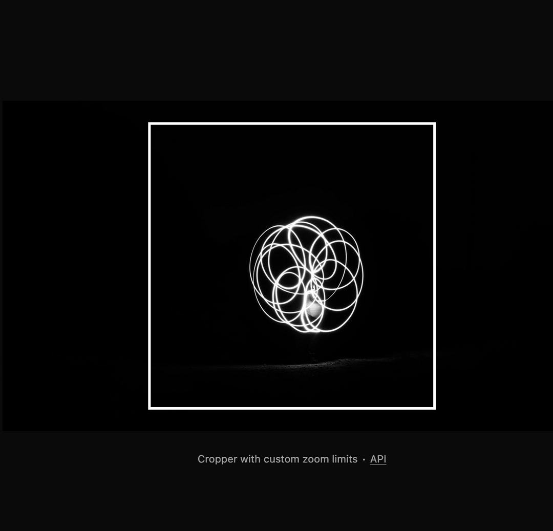
Here is Image Crop component
Built with React and Tailwind. Copy the prompt and paste it into Claude Code, Cursor or Lovable: your agent adds Image Crop to your project and fits it to your theme.
Code
How Image Crop is used: the demo's code. The component's own source comes with a free account.
Usage.tsx
import {
  Cropper,
  CropperCropArea,
  CropperDescription,
  CropperImage,
} from "@/components/ui/image-crop"

export default function Component() {
  return (
    <div className="flex min-h-screen w-full flex-col items-center justify-center gap-4 bg-background p-8">
      <Cropper
        className="h-96 w-full max-w-2xl"
        minZoom={2}
        maxZoom={10}
        image="https://cdn.21st.dev/assets/mirror/77/771ec29d3ba283b299ee6f56a2eb1e5e0bbd479573366c0fc2086d83d88ee3ec.jpg"
      >
        <CropperDescription />
        <CropperImage />
        <CropperCropArea />
      </Cropper>

      <p
        aria-live="polite"
        role="region"
        className="text-muted-foreground mt-2 text-xs"
      >
        Cropper with custom zoom limits ∙{" "}
        <a
          href="https://github.com/origin-space/image-cropper"
          className="hover:text-foreground underline"
          target="_blank"
        >
          API
        </a>
      </p>
    </div>
  )
}
Dependencies
More by Origin UI
View all
Dialog
1.2K
Avatar
950
useImageUpload
926
usePagination
622
Popover
384
Button
361
Command
320
Accordion
256