
About
Upgaraded shadcn/ui Input
Built with React and Tailwind. Copy the prompt and paste it into Claude Code, Cursor or Lovable: your agent adds Input to your project and fits it to your theme.
Code
How Input is used: the demo's code. The component's own source comes with a free account.
Usage.tsx
"use client";

import { Input } from "@/components/ui/input";
import { Label } from "@/components/ui/label";
import { LoaderCircle, Mic, Search } from "lucide-react";
import { useEffect, useId, useState } from "react";

function Component() {
  const id = useId();
  const [inputValue, setInputValue] = useState("");
  const [isLoading, setIsLoading] = useState<boolean>(false);

  useEffect(() => {
    if (inputValue) {
      setIsLoading(true);
      const timer = setTimeout(() => {
        setIsLoading(false);
      }, 500);
      return () => clearTimeout(timer);
    }
    setIsLoading(false);
  }, [inputValue]);

  return (
    <div className="space-y-2 min-w-[300px]">
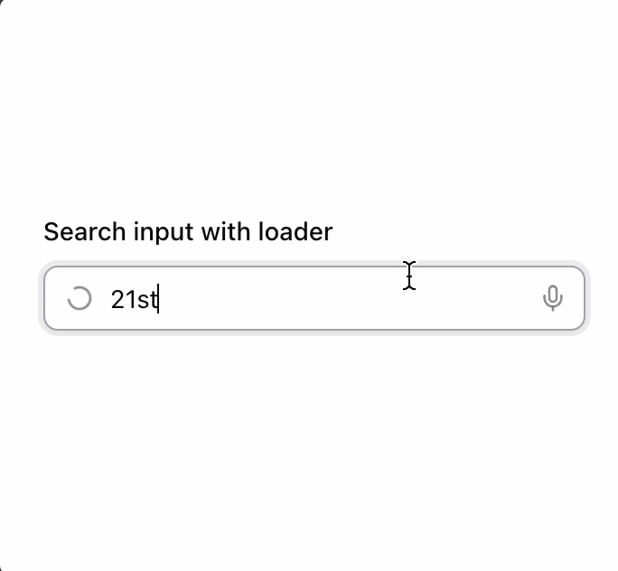
      <Label htmlFor={id}>Search input with loader</Label>
      <div className="relative">
        <Input
          id={id}
          className="peer pe-9 ps-9"
          placeholder="Search..."
          type="search"
          value={inputValue}
          onChange={(e) => setInputValue(e.target.value)}
        />
        <div className="pointer-events-none absolute inset-y-0 start-0 flex items-center justify-center ps-3 text-muted-foreground/80 peer-disabled:opacity-50">
          {isLoading ? (
            <LoaderCircle
              className="animate-spin"
              size={16}
              strokeWidth={2}
              role="status"
              aria-label="Loading..."
            />
          ) : (
            <Search size={16} strokeWidth={2} aria-hidden="true" />
          )}
        </div>
        <button
          className="absolute inset-y-0 end-0 flex h-full w-9 items-center justify-center rounded-e-lg text-muted-foreground/80 outline-offset-2 transition-colors hover:text-foreground focus:z-10 focus-visible:outline focus-visible:outline-2 focus-visible:outline-ring/70 disabled:pointer-events-none disabled:cursor-not-allowed disabled:opacity-50"
          aria-label="Press to speak"
          type="submit"
        >
          <Mic size={16} strokeWidth={2} aria-hidden="true" />
        </button>
      </div>
    </div>
  );
}

export { Component };
More by Origin UI
View all
Dialog
1.2K
Avatar
951
useImageUpload
926
usePagination
622
Popover
384
Button
362
Command
321
Accordion
257
More in Forms
View all

Premium Auth
497

Login 2
7
Authentication Card
45

Login 1
52

Contact Card
1K

Form
16

Form
136

Card Studio
41
