
About
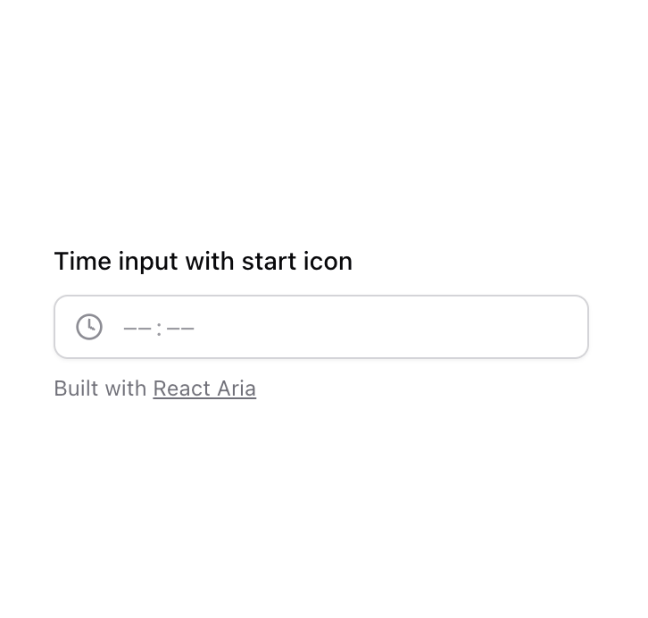
Upgaraded shadcn/ui Input
Built with React and Tailwind. Copy the prompt and paste it into Claude Code, Cursor or Lovable: your agent adds Input to your project and fits it to your theme.
Code
How Input is used: the demo's code. The component's own source comes with a free account.
Usage.tsx
"use client";

import { Clock } from "lucide-react";
import { DateInput, DateSegment, Label, TimeField } from "react-aria-components";

function Component() {
  return (
    <TimeField className="space-y-2">
      <Label className="text-sm font-medium text-foreground">Time input with start icon</Label>
      <div className="relative min-w-[300px]">
        <div className="pointer-events-none absolute inset-y-0 start-0 z-10 flex items-center justify-center ps-3 text-muted-foreground/80">
          <Clock size={16} strokeWidth={2} aria-hidden="true" />
        </div>
        <DateInput className="relative inline-flex h-9 w-full items-center overflow-hidden whitespace-nowrap rounded-lg border border-input bg-background px-3 py-2 ps-9 text-sm shadow-sm shadow-black/5 transition-shadow data-[focus-within]:border-ring data-[disabled]:opacity-50 data-[focus-within]:outline-none data-[focus-within]:ring-[3px] data-[focus-within]:ring-ring/20">
          {(segment) => (
            <DateSegment
              segment={segment}
              className="inline rounded p-0.5 text-foreground caret-transparent outline outline-0 data-[disabled]:cursor-not-allowed data-[focused]:bg-accent data-[invalid]:data-[focused]:bg-destructive data-[type=literal]:px-0 data-[focused]:data-[placeholder]:text-foreground data-[focused]:text-foreground data-[invalid]:data-[focused]:data-[placeholder]:text-destructive-foreground data-[invalid]:data-[focused]:text-destructive-foreground data-[invalid]:data-[placeholder]:text-destructive data-[invalid]:text-destructive data-[placeholder]:text-muted-foreground/70 data-[type=literal]:text-muted-foreground/70 data-[disabled]:opacity-50"
            />
          )}
        </DateInput>
      </div>
      <p className="mt-2 text-xs text-muted-foreground" role="region" aria-live="polite">
        Built with{" "}
        <a
          className="underline hover:text-foreground"
          href="https://react-spectrum.adobe.com/react-aria/DateField.html"
          target="_blank"
          rel="noopener nofollow"
        >
          React Aria
        </a>
      </p>
    </TimeField>
  );
}

export { Component };
Dependencies
More by Origin UI
View all
Dialog
1.2K
Avatar
951
useImageUpload
926
usePagination
622
Popover
384
Button
362
Command
321
Accordion
257