
About
Enhanced shadcn/ui select
Built with React and Tailwind. Copy the prompt and paste it into Claude Code, Cursor or Lovable: your agent adds Select to your project and fits it to your theme.
Code
How Select is used: the demo's code. The component's own source comes with a free account.
Usage.tsx
import { Label } from "@/components/ui/label";
import {
  Select,
  SelectContent,
  SelectItem,
  SelectTrigger,
  SelectValue,
} from "@/components/ui/select";
import { useId } from "react";

function Component() {
  const id = useId();
  return (
    <div className="space-y-2 min-w-[300px]">
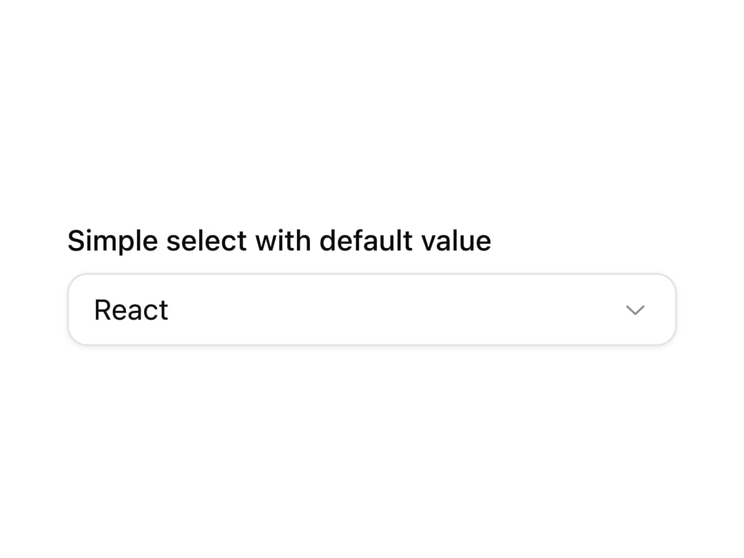
      <Label htmlFor={id}>Simple select with default value</Label>
      <Select defaultValue="1">
        <SelectTrigger id={id}>
          <SelectValue placeholder="Select framework" />
        </SelectTrigger>
        <SelectContent>
          <SelectItem value="1">React</SelectItem>
          <SelectItem value="2">Next.js</SelectItem>
          <SelectItem value="3">Astro</SelectItem>
          <SelectItem value="4">Gatsby</SelectItem>
        </SelectContent>
      </Select>
    </div>
  );
}

export { Component };

export default Component;
Dependencies
More by Origin UI
View all
Dialog
1.2K
Avatar
951
useImageUpload
926
usePagination
622
Popover
384
Button
364
Command
321
Accordion
258
More in Forms
View all

Premium Auth
500

Login 2
7
Authentication Card
47

Login 1
52

Contact Card
1K
Login Form
6

Form
16

Book A Demo 3
83
