
About
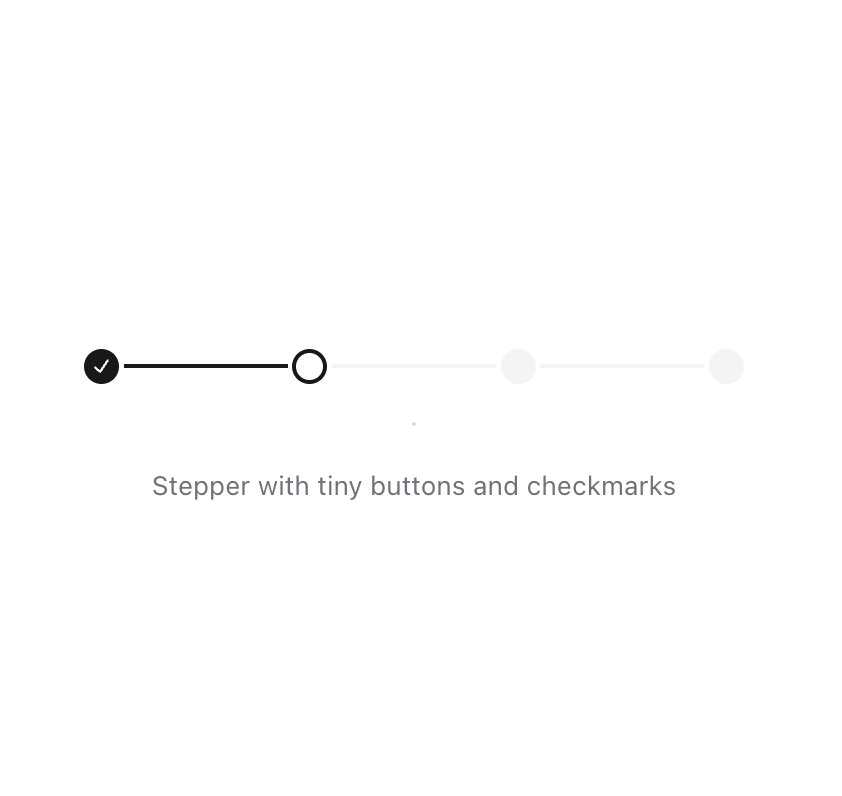
Stepper UI component.
Built with React and Tailwind. Copy the prompt and paste it into Claude Code, Cursor or Lovable: your agent adds Stepper to your project and fits it to your theme.
Code
How Stepper is used: the demo's code. The component's own source comes with a free account.
Usage.tsx
import {
  Stepper,
  StepperIndicator,
  StepperItem,
  StepperSeparator,
  StepperTrigger,
} from "@/components/ui/stepper";

const steps = [1, 2, 3, 4];

function Component() {
  return (
    <div className="mx-auto max-w-xl space-y-8 text-center min-w-[300px]">
      <Stepper defaultValue={2}>
        {steps.map((step) => (
          <StepperItem key={step} step={step} className="[&:not(:last-child)]:flex-1">
            <StepperTrigger>
              <StepperIndicator className="size-4 data-[state=active]:border-2 data-[state=active]:border-primary data-[state=active]:bg-transparent [&_span]:sr-only [&_svg]:size-3" />
            </StepperTrigger>
            {step < steps.length && <StepperSeparator />}
          </StepperItem>
        ))}
      </Stepper>
      <p className="mt-2 text-xs text-muted-foreground" role="region" aria-live="polite">
        Stepper with tiny buttons and checkmarks
      </p>
    </div>
  );
}

export { Component };
Dependencies
More by Origin UI
View all
Dialog
1.2K
Avatar
951
useImageUpload
926
usePagination
622
Popover
384
Button
364
Command
321
Accordion
258