
About
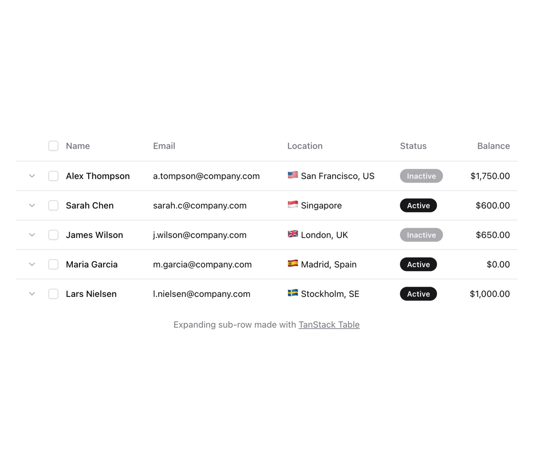
Shadcn table with enhanced appearance
Built with React and Tailwind. Copy the prompt and paste it into Claude Code, Cursor or Lovable: your agent adds Table to your project and fits it to your theme.
Code
How Table is used: the demo's code. The component's own source comes with a free account.
Usage.tsx
"use client";

import { cn } from "@/lib/utils";
import { Badge } from "@/components/ui/badge";
import { Button } from "@/components/ui/button";
import { Checkbox } from "@/components/ui/checkbox";
import {
  Table,
  TableBody,
  TableCell,
  TableHead,
  TableHeader,
  TableRow,
} from "@/components/ui/table";
import {
  ColumnDef,
  flexRender,
  getCoreRowModel,
  getExpandedRowModel,
  useReactTable,
} from "@tanstack/react-table";
import { ChevronDown, ChevronUp, Info } from "lucide-react";
import { Fragment, useEffect, useState } from "react";

type Item = {
  id: string;
  name: string;
  email: string;
  location: string;
  flag: string;
  status: "Active" | "Inactive" | "Pending";
  balance: number;
  note?: string;
};

const columns: ColumnDef<Item>[] = [
  {
    id: "expander",
    header: () => null,
    cell: ({ row }) => {
      return row.getCanExpand() ? (
        <Button
          {...{
            className: "size-7 shadow-none text-muted-foreground",
            onClick: row.getToggleExpandedHandler(),
            "aria-expanded": row.getIsExpanded(),
            "aria-label": row.getIsExpanded()
              ? `Collapse details for ${row.original.name}`
              : `Expand details for ${row.original.name}`,
            size: "icon",
            variant: "ghost",
          }}
        >
          {row.getIsExpanded() ? (
            <ChevronUp className="opacity-60" size={16} strokeWidth={2} aria-hidden="true" />
          ) : (
            <ChevronDown className="opacity-60" size={16} strokeWidth={2} aria-hidden="true" />
          )}
        </Button>
      ) : undefined;
    },
  },
  {
    id: "select",
    header: ({ table }) => (
      <Checkbox
        checked={
          table.getIsAllPageRowsSelected() || (table.getIsSomePageRowsSelected() && "indeterminate")
        }
        onCheckedChange={(value) => table.toggleAllPageRowsSelected(!!value)}
        aria-label="Select all"
      />
    ),
    cell: ({ row }) => (
      <Checkbox
        checked={row.getIsSelected()}
        onCheckedChange={(value) => row.toggleSelected(!!value)}
        aria-label="Select row"
      />
    ),
  },
  {
    header: "Name",
    accessorKey: "name",
    cell: ({ row }) => <div className="font-medium">{row.getValue("name")}</div>,
  },
  {
    header: "Email",
    accessorKey: "email",
  },
  {
    header: "Location",
    accessorKey: "location",
    cell: ({ row }) => (
      <div>
        <span className="text-lg leading-none">{row.original.flag}</span> {row.getValue("location")}
      </div>
    ),
  },
  {
    header: "Status",
    accessorKey: "status",
    cell: ({ row }) => (
      <Badge
        className={cn(
          row.getValue("status") === "Inactive" && "bg-muted-foreground/60 text-primary-foreground",
        )}
      >
        {row.getValue("status")}
      </Badge>
    ),
  },
  {
    header: () => <div className="text-right">Balance</div>,
    accessorKey: "balance",
    cell: ({ row }) => {
      const amount = parseFloat(row.getValue("balance"));
      const formatted = new Intl.NumberFormat("en-US", {
        style: "currency",
        currency: "USD",
      }).format(amount);
      return <div className="text-right">{formatted}</div>;
    },
  },
];

export default function Component() {
  const [data, setData] = useState<Item[]>([]);

  useEffect(() => {
    async function fetchPosts() {
      const res = await fetch(
        "https://res.cloudinary.com/dlzlfasou/raw/upload/users-01_fertyx.json",
      );
      const data = await res.json();
      setData(data.slice(0, 5)); // Limit to 5 items
    }
    fetchPosts();
  }, []);

  const table = useReactTable({
    data,
    columns,
    getRowCanExpand: (row) => Boolean(row.original.note),
    getCoreRowModel: getCoreRowModel(),
    getExpandedRowModel: getExpandedRowModel(),
  });

  return (
    <div className="bg-background w-[800px] max-w-[800px]">
      <Table>
        <TableHeader>
          {table.getHeaderGroups().map((headerGroup) => (
            <TableRow key={headerGroup.id} className="hover:bg-transparent">
              {headerGroup.headers.map((header) => {
                return (
                  <TableHead key={header.id}>
                    {header.isPlaceholder
                      ? null
                      : flexRender(header.column.columnDef.header, header.getContext())}
                  </TableHead>
                );
              })}
            </TableRow>
          ))}
        </TableHeader>
        <TableBody>
          {table.getRowModel().rows?.length ? (
            table.getRowModel().rows.map((row) => (
              <Fragment key={row.id}>
                <TableRow key={row.id} data-state={row.getIsSelected() && "selected"}>
                  {row.getVisibleCells().map((cell) => (
                    <TableCell
                      key={cell.id}
                      className="whitespace-nowrap [&:has([aria-expanded])]:w-px [&:has([aria-expanded])]:py-0 [&:has([aria-expanded])]:pr-0"
                    >
                      {flexRender(cell.column.columnDef.cell, cell.getContext())}
                    </TableCell>
                  ))}
                </TableRow>
                {row.getIsExpanded() && (
                  <TableRow>
                    <TableCell colSpan={row.getVisibleCells().length}>
                      <div className="flex items-start py-2 text-primary/80">
                        <span
                          className="me-3 mt-0.5 flex w-7 shrink-0 justify-center"
                          aria-hidden="true"
                        >
                          <Info className="opacity-60" size={16} strokeWidth={2} />
                        </span>
                        <p className="text-sm">{row.original.note}</p>
                      </div>
                    </TableCell>
                  </TableRow>
                )}
              </Fragment>
            ))
          ) : (
            <TableRow>
              <TableCell colSpan={columns.length} className="h-24 text-center">
                No results.
              </TableCell>
            </TableRow>
          )}
        </TableBody>
      </Table>
      <p className="mt-4 text-center text-sm text-muted-foreground">
        Expanding sub-row made with{" "}
        <a
          className="underline hover:text-foreground"
          href="https://tanstack.com/table"
          target="_blank"
          rel="noopener noreferrer"
        >
          TanStack Table
        </a>
      </p>
    </div>
  );
}

export { Component }
Dependencies
More by Origin UI
View all
Dialog
1.2K
Avatar
951
useImageUpload
926
usePagination
622
Popover
384
Button
364
Command
321
Accordion
258