
About
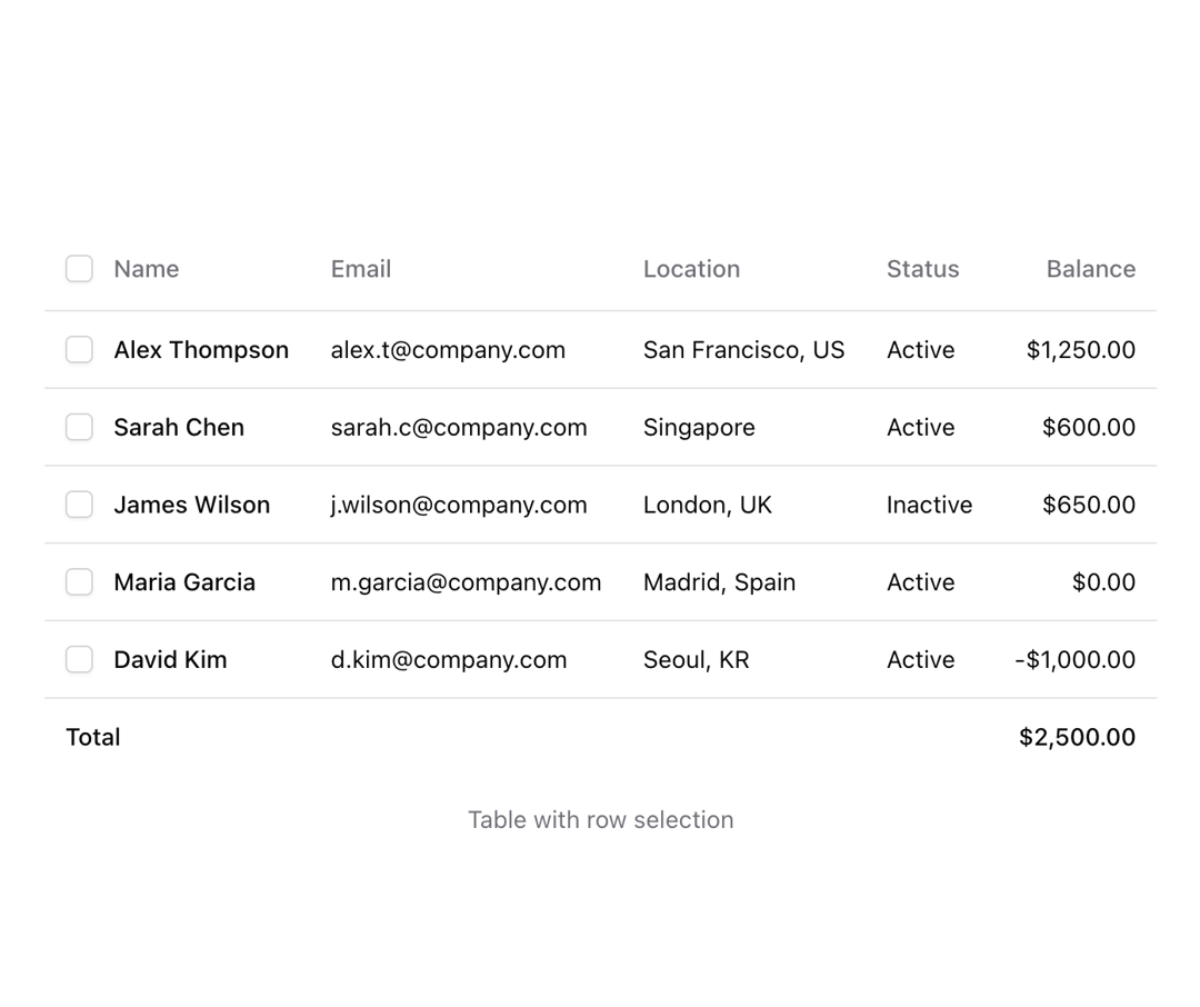
Shadcn table with enhanced appearance
Built with React and Tailwind. Copy the prompt and paste it into Claude Code, Cursor or Lovable: your agent adds Table to your project and fits it to your theme.
Code
How Table is used: the demo's code. The component's own source comes with a free account.
Usage.tsx
import { Checkbox } from "@/components/ui/checkbox";
import {
  Table,
  TableBody,
  TableCell,
  TableFooter,
  TableHead,
  TableHeader,
  TableRow,
} from "@/components/ui/table";
import { useId } from "react";

const items = [
  {
    id: "1",
    name: "Alex Thompson",
    email: "alex.t@company.com",
    location: "San Francisco, US",
    status: "Active",
    balance: "$1,250.00",
  },
  {
    id: "2",
    name: "Sarah Chen",
    email: "sarah.c@company.com",
    location: "Singapore",
    status: "Active",
    balance: "$600.00",
  },
  {
    id: "3",
    name: "James Wilson",
    email: "j.wilson@company.com",
    location: "London, UK",
    status: "Inactive",
    balance: "$650.00",
  },
  {
    id: "4",
    name: "Maria Garcia",
    email: "m.garcia@company.com",
    location: "Madrid, Spain",
    status: "Active",
    balance: "$0.00",
  },
  {
    id: "5",
    name: "David Kim",
    email: "d.kim@company.com",
    location: "Seoul, KR",
    status: "Active",
    balance: "-$1,000.00",
  },
];

function Component() {
  const id = useId();
  return (
    <div className="bg-background">
      <Table>
        <TableHeader>
          <TableRow className="hover:bg-transparent">
            <TableHead>
              <Checkbox id={id} />
            </TableHead>
            <TableHead>Name</TableHead>
            <TableHead>Email</TableHead>
            <TableHead>Location</TableHead>
            <TableHead>Status</TableHead>
            <TableHead className="text-right">Balance</TableHead>
          </TableRow>
        </TableHeader>
        <TableBody>
          {items.map((item) => (
            <TableRow key={item.id} className="has-[[data-state=checked]]:bg-muted/50">
              <TableCell>
                <Checkbox id={`table-checkbox-${item.id}`} />
              </TableCell>
              <TableCell className="font-medium">{item.name}</TableCell>
              <TableCell>{item.email}</TableCell>
              <TableCell>{item.location}</TableCell>
              <TableCell>{item.status}</TableCell>
              <TableCell className="text-right">{item.balance}</TableCell>
            </TableRow>
          ))}
        </TableBody>
        <TableFooter className="bg-transparent">
          <TableRow className="hover:bg-transparent">
            <TableCell colSpan={5}>Total</TableCell>
            <TableCell className="text-right">$2,500.00</TableCell>
          </TableRow>
        </TableFooter>
      </Table>
      <p className="mt-4 text-center text-sm text-muted-foreground">Table with row selection</p>
    </div>
  );
}

export { Component }More by Origin UI
View all
Dialog
1.2K
Avatar
951
useImageUpload
926
usePagination
622
Popover
384
Button
364
Command
321
Accordion
258