
About
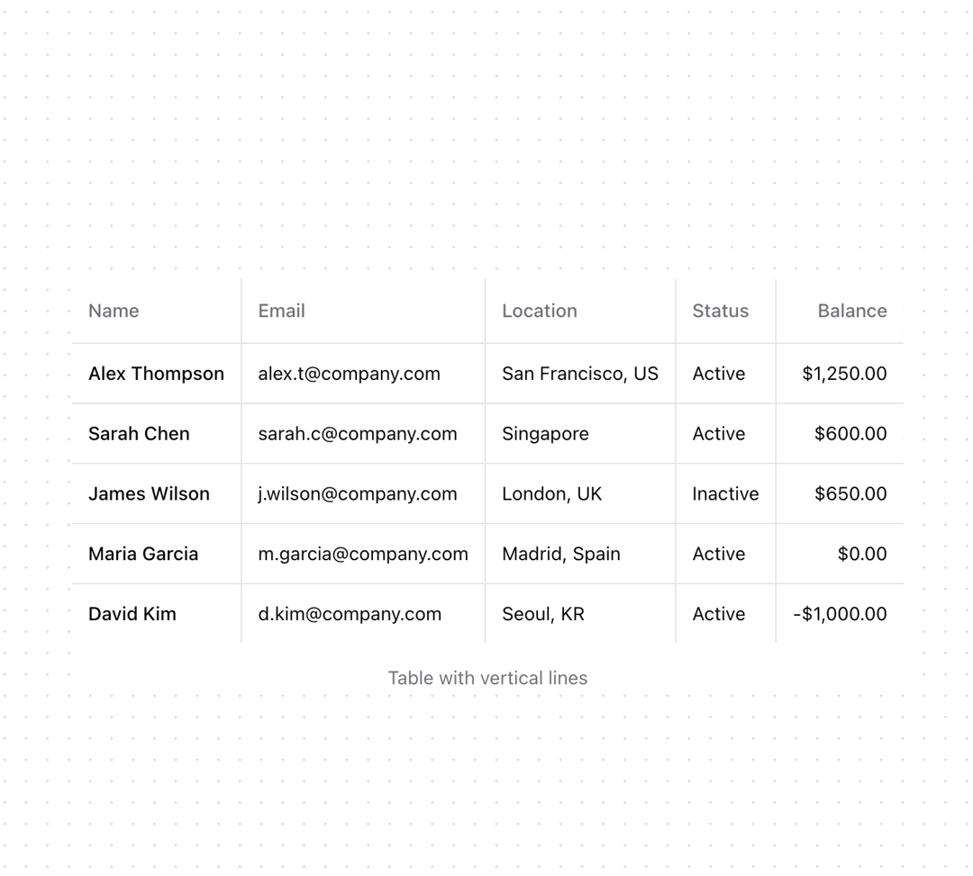
Shadcn table with enhanced appearance
Built with React and Tailwind. Copy the prompt and paste it into Claude Code, Cursor or Lovable: your agent adds Table to your project and fits it to your theme.
Code
How Table is used: the demo's code. The component's own source comes with a free account.
Usage.tsx
import {
  Table,
  TableBody,
  TableCell,
  TableHead,
  TableHeader,
  TableRow,
} from "@/components/ui/table";

const items = [
  {
    id: "1",
    name: "Alex Thompson",
    email: "alex.t@company.com",
    location: "San Francisco, US",
    status: "Active",
    balance: "$1,250.00",
  },
  {
    id: "2",
    name: "Sarah Chen",
    email: "sarah.c@company.com",
    location: "Singapore",
    status: "Active",
    balance: "$600.00",
  },
  {
    id: "3",
    name: "James Wilson",
    email: "j.wilson@company.com",
    location: "London, UK",
    status: "Inactive",
    balance: "$650.00",
  },
  {
    id: "4",
    name: "Maria Garcia",
    email: "m.garcia@company.com",
    location: "Madrid, Spain",
    status: "Active",
    balance: "$0.00",
  },
  {
    id: "5",
    name: "David Kim",
    email: "d.kim@company.com",
    location: "Seoul, KR",
    status: "Active",
    balance: "-$1,000.00",
  },
];

function Component() {
  return (
    <div className="bg-background">
      <Table>
        <TableHeader className="bg-transparent">
          <TableRow className="*:border-border hover:bg-transparent [&>:not(:last-child)]:border-r">
            <TableHead>Name</TableHead>
            <TableHead>Email</TableHead>
            <TableHead>Location</TableHead>
            <TableHead>Status</TableHead>
            <TableHead className="text-right">Balance</TableHead>
          </TableRow>
        </TableHeader>
        <TableBody className="[&_td:first-child]:rounded-l-lg [&_td:last-child]:rounded-r-lg">
          {items.map((item) => (
            <TableRow
              key={item.id}
              className="*:border-border hover:bg-transparent [&>:not(:last-child)]:border-r"
            >
              <TableCell className="font-medium">{item.name}</TableCell>
              <TableCell>{item.email}</TableCell>
              <TableCell>{item.location}</TableCell>
              <TableCell>{item.status}</TableCell>
              <TableCell className="text-right">{item.balance}</TableCell>
            </TableRow>
          ))}
        </TableBody>
      </Table>
      <p className="mt-4 text-center text-sm text-muted-foreground">Table with vertical lines</p>
    </div>
  );
}

export { Component }
More by Origin UI
View all
Dialog
1.2K
Avatar
952
useImageUpload
926
usePagination
622
Popover
384
Button
364
Command
321
Accordion
258
More in Dashboards
View all
Dashboard with Collapsible Sidebar
2.4K

Sidebar
235

SaaS Template
2.4K
Stats Bento
1.1K

Financial Bento Grid
71
Stats cards with links
33

Course Design Cards
1.1K

Chat template
598


