
About
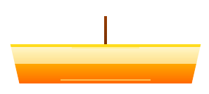
Beautiful animated lamp component for theme switching with Framer Motion
Built with React and Tailwind. Copy the prompt and paste it into Claude Code, Cursor or Lovable: your agent adds Lamp Toggle - Theme Switcher to your project and fits it to your theme.
Code
How Lamp Toggle - Theme Switcher is used: the demo's code. The component's own source comes with a free account.
Usage.tsx
import { Component } from "@/components/ui/lamp-toggle-theme-switcher";
import { useState, useEffect } from "react";

export default function DemoOne() {
  const [isDark, setIsDark] = useState(false);
  const [currentSize, setCurrentSize] = useState<'small' | 'medium' | 'large'>('medium');
  const [animationSpeed, setAnimationSpeed] = useState(0.3);

  // Apply theme to body for realistic demo
  useEffect(() => {
    document.body.style.transition = 'all 0.5s ease';
    document.body.style.backgroundColor = isDark ? '#111827' : '#ffffff';
    document.body.style.color = isDark ? '#ffffff' : '#111827';
  }, [isDark]);

  const handleToggle = () => {
    setIsDark(!isDark);
  };

  return (
    <div className={`min-h-screen transition-all duration-500 ${
      isDark ? 'bg-gray-900 text-white' : 'bg-white text-gray-900'
    }`}>
      {/* Main Demo Lamp */}
      <Component
        isDark={isDark}
        onToggle={handleToggle}
        size={currentSize}
        animationDuration={animationSpeed}
      />

      <div className="container mx-auto px-6 pt-24 pb-12">
        {/* Header */}
        <div className="text-center mb-12">
          <div className="text-6xl mb-4">🏮</div>
          <h1 className="text-5xl font-bold mb-4 bg-gradient-to-r from-yellow-400 to-orange-500 bg-clip-text text-transparent">
            Lamp Toggle
          </h1>
          <p className="text-xl opacity-80 mb-8 max-w-2xl mx-auto">
            Beautiful animated lamp component for theme switching. Click the lamp above to see the magic! ✨
          </p>

          <div className={`inline-flex items-center gap-2 px-4 py-2 rounded-full ${
            isDark ? 'bg-gray-800 text-gray-300' : 'bg-gray-100 text-gray-700'
          }`}>
            <div className={`w-3 h-3 rounded-full ${isDark ? 'bg-blue-400' : 'bg-yellow-400'}`}></div>
            Current Theme: <strong>{isDark ? 'Dark' : 'Light'}</strong>
          </div>
        </div>

        {/* Interactive Controls */}
        <div className="max-w-4xl mx-auto mb-12">
          <div className={`p-6 rounded-2xl ${isDark ? 'bg-gray-800/50' : 'bg-gray-50'} backdrop-blur-sm`}>
            <h3 className="text-xl font-semibold mb-6 text-center">🎛️ Customize the Lamp</h3>

            <div className="grid md:grid-cols-2 gap-8">
              {/* Size Control */}
              <div>
                <label className="block text-sm font-medium mb-3">Lamp Size</label>
                <div className="flex gap-2">
                  {(['small', 'medium', 'large'] as const).map((size) => (
                    <button
                      key={size}
                      onClick={() => setCurrentSize(size)}
                      className={`px-4 py-2 rounded-lg capitalize transition-all ${
                        currentSize === size
                          ? 'bg-blue-500 text-white shadow-lg'
                          : isDark
                            ? 'bg-gray-700 text-gray-300 hover:bg-gray-600'
                            : 'bg-gray-200 text-gray-700 hover:bg-gray-300'
                      }`}
                    >
                      {size}
                    </button>
                  ))}
                </div>
              </div>

              {/* Animation Speed */}
              <div>
                <label className="block text-sm font-medium mb-3">
                  Animation Speed: {animationSpeed}s
                </label>
                <input
                  type="range"
                  min="0.1"
                  max="1"
                  step="0.1"
                  value={animationSpeed}
                  onChange={(e) => setAnimationSpeed(parseFloat(e.target.value))}
                  className="w-full"
                />
              </div>
            </div>
          </div>
        </div>

        {/* Size Comparison */}
        <div className="mb-12">
          <h3 className="text-2xl font-bold text-center mb-8">Size Variations</h3>
          <div className="flex justify-center items-end gap-8 flex-wrap">
            {(['small', 'medium', 'large'] as const).map((size) => (
              <div key={size} className="text-center">
                <div className="relative mb-4">
                  <Component
                    isDark={isDark}
                    onToggle={handleToggle}
                    size={size}
                    className="relative top-0 left-0 transform-none"
                    animationDuration={animationSpeed}
                  />
                </div>
                <span className="text-sm opacity-70 capitalize">{size}</span>
              </div>
            ))}
          </div>
        </div>

        {/* Features Grid */}
        <div className="grid md:grid-cols-3 gap-6 mb-12">
          <div className={`p-6 rounded-xl ${isDark ? 'bg-gray-800' : 'bg-gray-50'}`}>
            <div className="text-3xl mb-3">🎨</div>
            <h3 className="font-semibold mb-2">Smooth Animations</h3>
            <p className="text-sm opacity-80">Powered by Framer Motion for buttery smooth transitions</p>
          </div>

          <div className={`p-6 rounded-xl ${isDark ? 'bg-gray-800' : 'bg-gray-50'}`}>
            <div className="text-3xl mb-3">⚡</div>
            <h3 className="font-semibold mb-2">TypeScript Ready</h3>
            <p className="text-sm opacity-80">Full TypeScript support with proper type definitions</p>
          </div>

          <div className={`p-6 rounded-xl ${isDark ? 'bg-gray-800' : 'bg-gray-50'}`}>
            <div className="text-3xl mb-3">🎛️</div>
            <h3 className="font-semibold mb-2">Customizable</h3>
            <p className="text-sm opacity-80">Multiple sizes, custom animations, and flexible positioning</p>
          </div>
        </div>

        {/* Code Examples */}
        <div className="max-w-4xl mx-auto">
          <h3 className="text-2xl font-bold text-center mb-8">📋 Usage Examples</h3>

          <div className="space-y-6">
            {/* Basic Usage */}
            <div className={`p-6 rounded-xl ${isDark ? 'bg-gray-800' : 'bg-gray-50'}`}>
              <h4 className="font-semibold mb-3">Basic Usage</h4>
              <pre className={`p-4 rounded-lg overflow-x-auto text-sm ${
                isDark ? 'bg-gray-900' : 'bg-white'
              }`}>
                <code>{`import { Component } from '@/components/ui/lamp-toggle-theme-switcher';

function App() {
  const [isDark, setIsDark] = useState(false);

  return (
    <Component
      isDark={isDark}
      onToggle={() => setIsDark(!isDark)}
    />
  );
}`}</code>
              </pre>
            </div>

            {/* Advanced Usage */}
            <div className={`p-6 rounded-xl ${isDark ? 'bg-gray-800' : 'bg-gray-50'}`}>
              <h4 className="font-semibold mb-3">Advanced Configuration</h4>
              <pre className={`p-4 rounded-lg overflow-x-auto text-sm ${
                isDark ? 'bg-gray-900' : 'bg-white'
              }`}>
                <code>{`<Component
  isDark={isDark}
  onToggle={handleToggle}
  size="large"
  animationDuration={0.5}
  className="custom-position"
/>`}</code>
              </pre>
            </div>

            {/* With Theme Context */}
            <div className={`p-6 rounded-xl ${isDark ? 'bg-gray-800' : 'bg-gray-50'}`}>
              <h4 className="font-semibold mb-3">With Theme Context</h4>
              <pre className={`p-4 rounded-lg overflow-x-auto text-sm ${
                isDark ? 'bg-gray-900' : 'bg-white'
              }`}>
                <code>{`import { useTheme } from './theme-context';

function ThemeLamp() {
  const { isDark, toggleTheme } = useTheme();

  return (
    <Component
      isDark={isDark}
      onToggle={toggleTheme}
    />
  );
}`}</code>
              </pre>
            </div>
          </div>
        </div>

        {/* Footer */}
        <div className="text-center mt-16 pt-8 border-t border-gray-200 dark:border-gray-700">
          <p className="opacity-70 mb-4">
            Made with ❤️ by Ozhan Gebesoglu
          </p>
          <div className="flex justify-center gap-4">
            <a
              href="https://github.com/ozhangebesoglu/react-lamp-toggle"
              className={`px-4 py-2 rounded-lg transition-colors ${
                isDark
                  ? 'bg-gray-700 hover:bg-gray-600 text-gray-300'
                  : 'bg-gray-200 hover:bg-gray-300 text-gray-700'
              }`}
            >
              ⭐ GitHub
            </a>
            <button
              onClick={handleToggle}
              className="px-4 py-2 bg-gradient-to-r from-yellow-400 to-orange-500 text-white rounded-lg hover:from-yellow-500 hover:to-orange-600 transition-all"
            >
              🏮 Toggle Theme
            </button>
          </div>
        </div>
      </div>
    </div>
  );
}
Dependencies
More by Özhan Gebeşoğlu
View all
Parallax Card Grid
More in Buttons
View all
Button Save
46

Button
20

Eclipse Button
5

Button
6

Button
14

Button Group
37

Button
32
Split Button
32

