
About
Animation Parallax Card Grid
Built with React and Tailwind. Copy the prompt and paste it into Claude Code, Cursor or Lovable: your agent adds Parallax Card Grid to your project and fits it to your theme.
Code
How Parallax Card Grid is used: the demo's code. The component's own source comes with a free account.
Usage.tsx
import { Component } from "@/components/ui/parallax-card-grid";

export default function ParallaxCardGridDemo() {
  const customItems = [
    <div className="space-y-3">
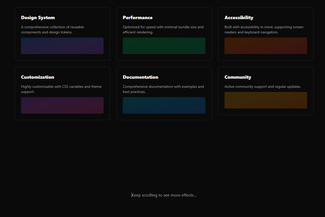
      <h3 className="text-lg font-semibold text-foreground">Design System</h3>
      <p className="text-sm text-muted-foreground">A comprehensive collection of reusable components and design tokens.</p>
      <div className="h-16 bg-gradient-to-br from-blue-500/20 to-purple-500/20 rounded"></div>
    </div>,
    <div className="space-y-3">
      <h3 className="text-lg font-semibold text-foreground">Performance</h3>
      <p className="text-sm text-muted-foreground">Optimized for speed with minimal bundle size and efficient rendering.</p>
      <div className="h-16 bg-gradient-to-br from-green-500/20 to-emerald-500/20 rounded"></div>
    </div>,
    <div className="space-y-3">
      <h3 className="text-lg font-semibold text-foreground">Accessibility</h3>
      <p className="text-sm text-muted-foreground">Built with accessibility in mind, supporting screen readers and keyboard navigation.</p>
      <div className="h-16 bg-gradient-to-br from-orange-500/20 to-red-500/20 rounded"></div>
    </div>,
    <div className="space-y-3">
      <h3 className="text-lg font-semibold text-foreground">Customization</h3>
      <p className="text-sm text-muted-foreground">Highly customizable with CSS variables and theme support.</p>
      <div className="h-16 bg-gradient-to-br from-purple-500/20 to-pink-500/20 rounded"></div>
    </div>,
    <div className="space-y-3">
      <h3 className="text-lg font-semibold text-foreground">Documentation</h3>
      <p className="text-sm text-muted-foreground">Comprehensive documentation with examples and best practices.</p>
      <div className="h-16 bg-gradient-to-br from-cyan-500/20 to-blue-500/20 rounded"></div>
    </div>,
    <div className="space-y-3">
      <h3 className="text-lg font-semibold text-foreground">Community</h3>
      <p className="text-sm text-muted-foreground">Active community support and regular updates.</p>
      <div className="h-16 bg-gradient-to-br from-yellow-500/20 to-orange-500/20 rounded"></div>
    </div>
  ];

  return (
    <div className="min-h-screen bg-background p-8">
      <div className="max-w-6xl mx-auto space-y-12">
        <div className="text-center space-y-4">
          <h1 className="text-4xl font-bold text-foreground">Parallax Card Grid</h1>
          <p className="text-lg text-muted-foreground">Scroll and hover to see the parallax effects</p>
        </div>

        <Component
          items={customItems}
          gap={24}
          columns={3}
          intensity={2}
          className="mb-24"
        />

        <div className="h-96 flex items-center justify-center">
          <p className="text-muted-foreground">Keep scrolling to see more effects...</p>
        </div>

        <Component
          gap={20}
          columns={2}
          intensity={1.5}
          className="mb-24"
        />

        <div className="h-96 flex items-center justify-center">
          <p className="text-muted-foreground">End of demo</p>
        </div>
      </div>
    </div>
  );
}
More by Özhan Gebeşoğlu
View all
Lamp Toggle - Theme Switcher
More in Features
View all

Features 8
3.1K

Feature Sections
107

Grid Feature Cards
1.9K

Feature 72
122
Features 2
322
Feature Modern
9
Features 4
368
Features Card
201

