About
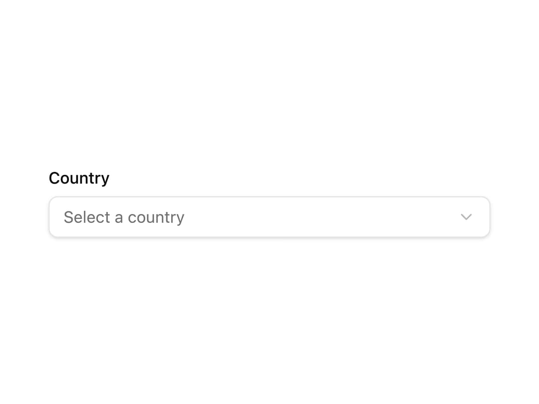
A select/dropdown field wired to a form's state that shows a label, its options, and an inline validation error message.
Built with React and Tailwind. Copy the prompt and paste it into Claude Code, Cursor or Lovable: your agent adds Form Select to your project and fits it to your theme.
Code
How Form Select is used: the demo's code. The component's own source comes with a free account.
Usage.tsx
"use client";

import FormSelect from "@/components/ui/form-select";
import { useForm } from "@tanstack/react-form";

export default function FormSelectDemo() {
  const form = useForm({
    defaultValues: {
      country: "",
    },
  });

  return (
    <form
      onSubmit={(e) => {
        e.preventDefault();
        form.handleSubmit();
      }}
      className="flex w-full max-w-sm flex-col gap-6"
    >
      <FormSelect
        form={form}
        name="country"
        label="Country"
        placeholder="Select a country"
        options={[
          { label: "United States", value: "us" },
          { label: "Canada", value: "ca" },
          { label: "United Kingdom", value: "uk" },
        ]}
      />
    </form>
  );
}
Dependencies
More by pacekit
View all

AI Response Writer
357
Mouse Wave Text
16
Bouncing Text
14
Gradient Shadow
12
Scramble Text
9
AI Suggestions
5
Squash Text
5
GitHub Star Counter
More in Forms
View all

Premium Auth
496

Login 2
7
Authentication Card
45

Login 1
52

Form
16

Contact Card
1K

Card Studio
41

Book A Demo 3
83
