About
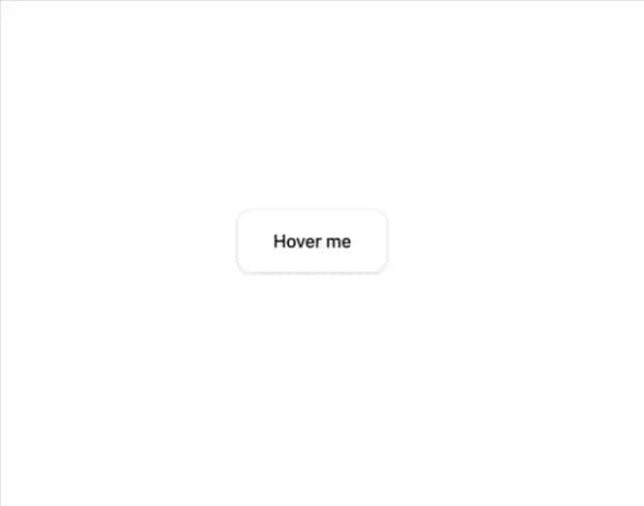
A wrapper that adds an animated, gradient glowing shadow behind its child on hover.
Built with React and Tailwind. Copy the prompt and paste it into Claude Code, Cursor or Lovable: your agent adds Gradient Shadow to your project and fits it to your theme.
Code
How Gradient Shadow is used: the demo's code. The component's own source comes with a free account.
Usage.tsx
import { GradientShadow } from "@/components/ui/gradient-shadow";

export default function GradientShadowDemo() {
  return (
    <div className="flex min-h-[320px] w-full items-center justify-center bg-background p-10">
      <GradientShadow>
        <button className="rounded-xl border border-border bg-card px-8 py-4 text-base font-medium text-card-foreground shadow-sm transition-colors">
          Hover me
        </button>
      </GradientShadow>
    </div>
  );
}
Dependencies
More by pacekit
View all

AI Response Writer
357
Mouse Wave Text
16
Bouncing Text
14
Scramble Text
9
AI Suggestions
6
Squash Text
5
GitHub Star Counter
Form Input
More in Buttons
View all
Button Save
46

Button
20

Eclipse Button
5

Button
6

Button
14

Button Group
37

Button
32
Split Button
32

