

About
A collapsible accordion whose rows spring-animate open/closed height and chevron rotation, with a hover pill that previews the nearest row before you click.
Built with React and Tailwind. Copy the prompt and paste it into Claude Code, Cursor or Lovable: your agent adds Proximity Accordion to your project and fits it to your theme.
Code
How Proximity Accordion is used: the demo's code. The component's own source comes with a free account.
Usage.tsx
"use client";

import {
  Accordion,
  AccordionContent,
  AccordionItem,
  AccordionTrigger,
} from "@/components/ui/accordion";

export default function AccordionStandaloneExample() {
  return (
    <Accordion type="single" defaultValue="what" className="max-w-sm">
      <AccordionItem value="what">
        <AccordionTrigger>What is this component?</AccordionTrigger>
        <AccordionContent>
          A collapsible accordion with animated expand/collapse and a
          spring-driven chevron.
        </AccordionContent>
      </AccordionItem>
      <AccordionItem value="motion">
        <AccordionTrigger>How does the motion work?</AccordionTrigger>
        <AccordionContent>
          Height animates to a measured pixel target with spring.moderate, not
          height: auto — that keeps the spring from overshooting.
        </AccordionContent>
      </AccordionItem>
    </Accordion>
  );
}
Dependencies
More by Purbayan Pramanik
View all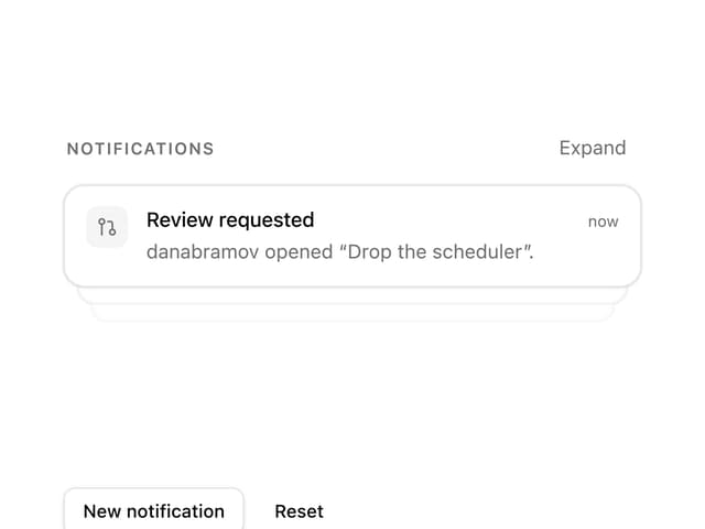
Notification Stack
23
Plan Checklist

Agent Activity
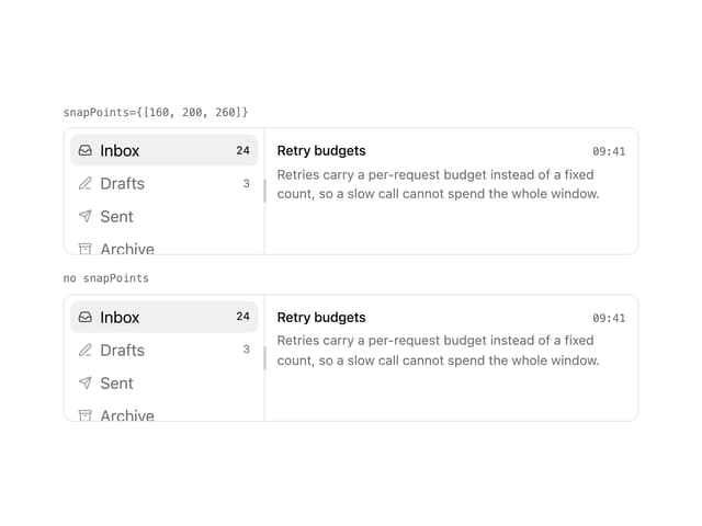
Snap Panels
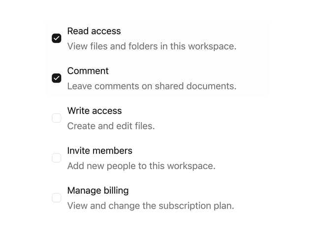
Checkbox Group
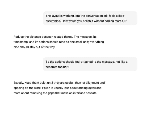
Conversation