
About
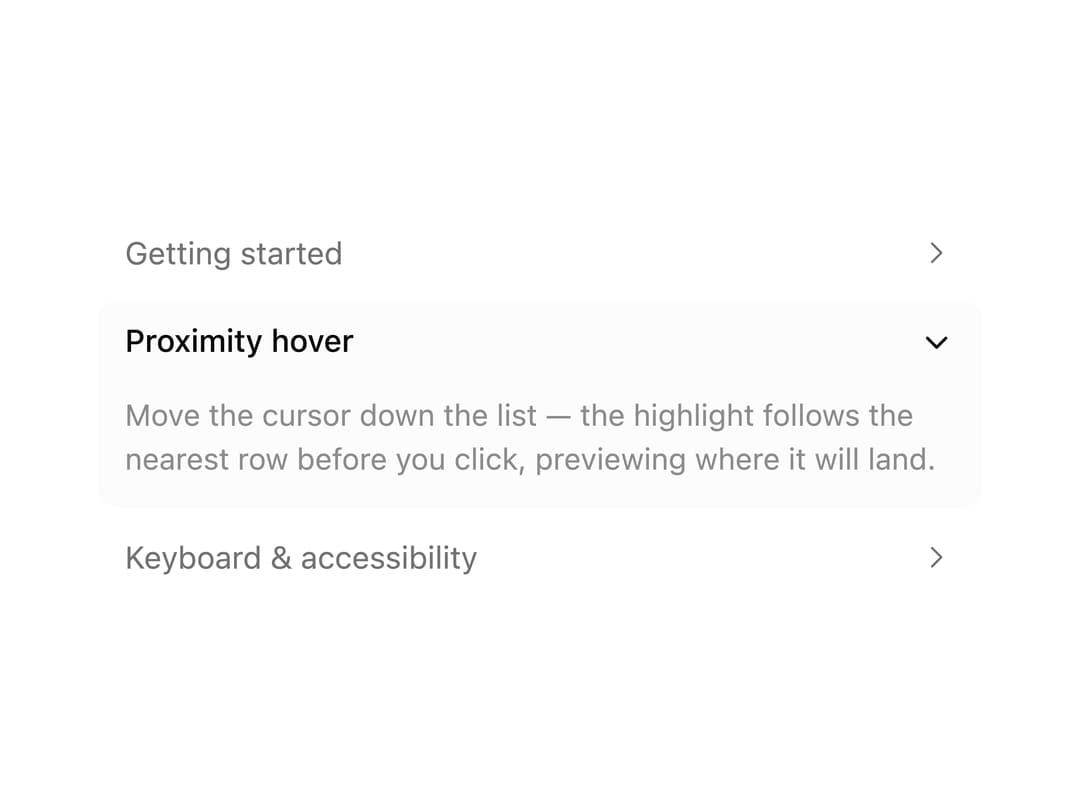
A collapsible accordion whose rows spring-animate open/closed height and chevron rotation, with a hover pill that previews the nearest row before you click.
Built with React and Tailwind. Copy the prompt and paste it into Claude Code, Cursor or Lovable: your agent adds Proximity Accordion to your project and fits it to your theme.
Code
How Proximity Accordion is used: the demo's code. The component's own source comes with a free account.
Usage.tsx
"use client";

import {
  Accordion,
  AccordionContent,
  AccordionItem,
  AccordionTrigger,
} from "@/components/ui/accordion";

const items = [
  {
    value: "getting-started",
    title: "Getting started",
    body: "Install the primitive and compose Accordion/AccordionItem/AccordionTrigger/AccordionContent — every item gets proximity hover automatically.",
  },
  {
    value: "proximity",
    title: "Proximity hover",
    body: "Move the cursor down the list — the highlight follows the nearest row before you click, previewing where it will land.",
  },
  {
    value: "keyboard",
    title: "Keyboard & accessibility",
    body: "Built on Base UI's Accordion primitive: full keyboard navigation, focus management, and ARIA wiring come for free.",
  },
];

export default function AccordionSingleExpandExample() {
  return (
    <Accordion type="single" defaultValue="proximity" className="max-w-sm">
      {items.map((item) => (
        <AccordionItem key={item.value} value={item.value}>
          <AccordionTrigger>{item.title}</AccordionTrigger>
          <AccordionContent>{item.body}</AccordionContent>
        </AccordionItem>
      ))}
    </Accordion>
  );
}
Dependencies
More by Purbayan Pramanik
View all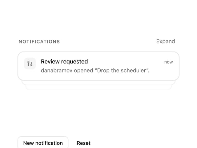
Notification Stack
23
Plan Checklist
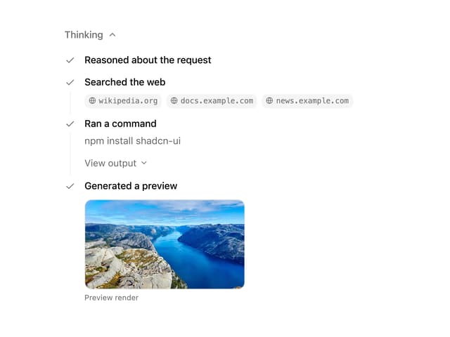
Agent Activity
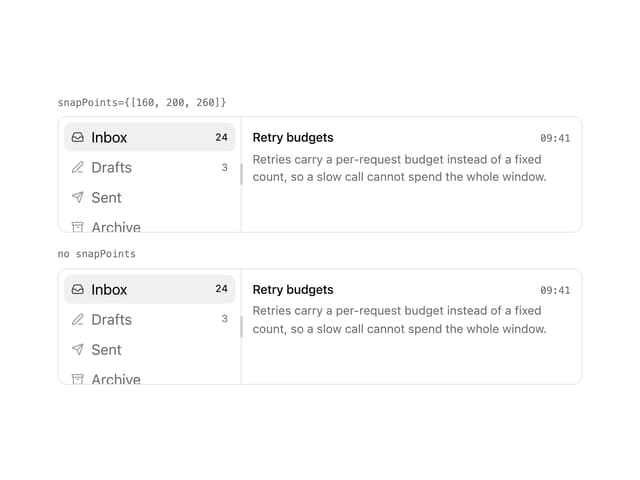
Snap Panels
Checkbox Group
Conversation