About
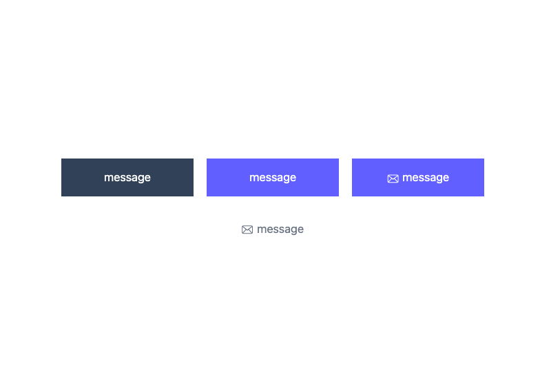
Here is Button Ui components
Built with React and Tailwind. Copy the prompt and paste it into Claude Code, Cursor or Lovable: your agent adds Button Ui to your project and fits it to your theme.
Code
How Button Ui is used: the demo's code. The component's own source comes with a free account.
Usage.tsx
"use client";

import React from "react";


export default function Example() {
    return (
        <div className="flex flex-wrap items-center justify-center gap-4 md:gap-10">
            <button type="button" className="w-40 py-3 active:scale-95 transition text-sm text-white bg-slate-700"><p className="mb-0.5">message</p></button>
            <button type="button" className="w-40 py-3 active:scale-95 transition text-sm text-white bg-indigo-500"><p className="mb-0.5">message</p></button>
            <button type="button" className="w-40 py-3 active:scale-95 transition text-sm text-white bg-indigo-500 flex items-center justify-center gap-1">
                <svg className="mt-0.5" width="17" height="13" viewBox="0 0 17 13" fill="none" xmlns="http://www.w3.org/2000/svg">
                    <path fillRule="evenodd" clipRule="evenodd" d="M15.568 10.304c0 .1-.02.195-.047.285l-4.403-4.735 4.45-3.46zm-13.074.962 4.462-4.754 1.69 1.278 1.618-1.286 4.535 4.762c-.071.016-12.234.016-12.305 0m-.769-.962v-7.91l4.45 3.46-4.403 4.735a1 1 0 0 1-.047-.285m13.349-8.9L8.647 6.35 2.219 1.404zm-.495-.988H2.714A1.98 1.98 0 0 0 .736 2.393v7.91c0 1.093.886 1.978 1.978 1.978h11.865a1.98 1.98 0 0 0 1.978-1.977v-7.91A1.98 1.98 0 0 0 14.579.415" fill="#fff"/>
                </svg>
                <p className="mb-0.5">message</p>
            </button>
            <button type="button" className="w-40 py-3 active:scale-95 transition text-sm text-gray-500 bg-white flex items-center justify-center gap-1">
                <svg className="mt-0.5" width="17" height="13" viewBox="0 0 17 13" fill="none" xmlns="http://www.w3.org/2000/svg">
                    <path fillRule="evenodd" clipRule="evenodd" d="M15.03 10.228c0 .1-.018.196-.046.286L10.58 5.78l4.45-3.46zm-13.073.963L6.42 6.436l1.69 1.278L9.727 6.43l4.535 4.762c-.071.016-12.234.016-12.305 0m-.769-.963v-7.91l4.45 3.46-4.403 4.736a1 1 0 0 1-.047-.286M14.537 1.33 8.108 6.273 1.682 1.33zm-.495-.988H2.177A1.98 1.98 0 0 0 .199 2.318v7.91c0 1.092.886 1.978 1.978 1.978h11.865a1.98 1.98 0 0 0 1.978-1.978v-7.91A1.98 1.98 0 0 0 14.042.341" fill="#6B7280"/>
                </svg>
                <p className="mb-0.5">message</p>
            </button>
        </div>
    );
};
More by prebuiltui
View all

Image Gallery
1.3K
Hero Section
412
Feature Sections
344
Testimonial
303
Cards
231
FAQ Sections
177
Form
136
Login Form
125
More in Buttons
View all

Button
14
Button
34
Texture Button
92
Button Save
46

Button
64

Button Group
3

App Store Button
454

Notification Button
103

