
About
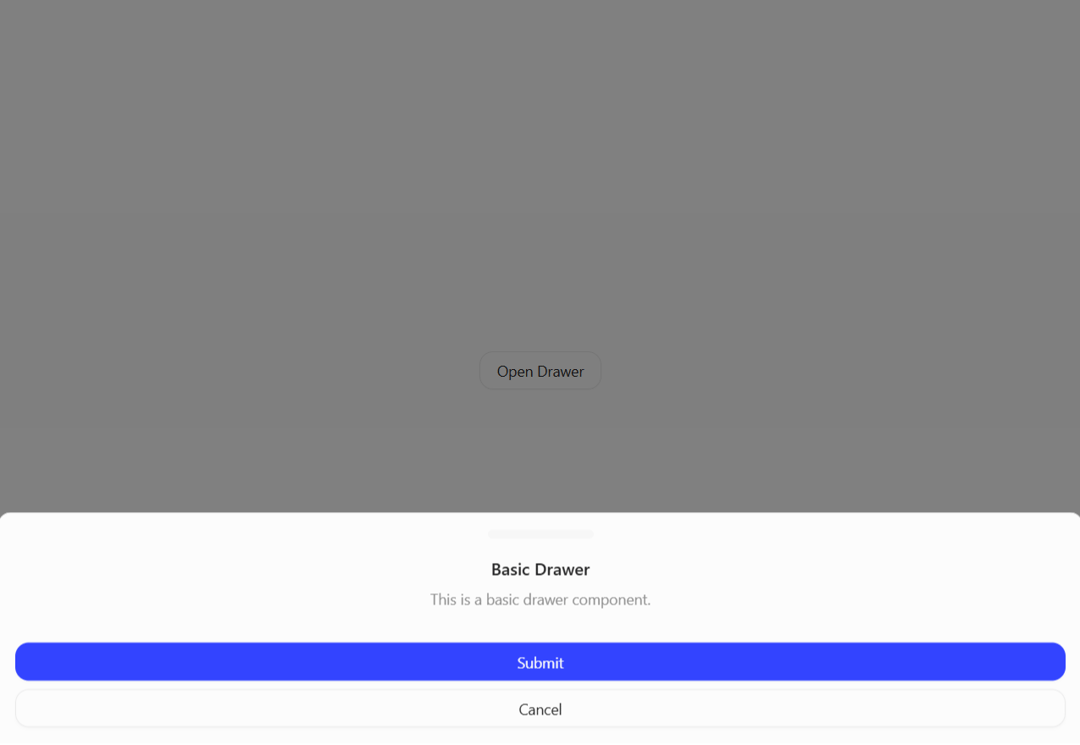
A customizable drawer component built on top of Vaul with smooth animations and flexible positioning.
Built with React and Tailwind. Copy the prompt and paste it into Claude Code, Cursor or Lovable: your agent adds Drawer to your project and fits it to your theme.
Code
How Drawer is used: the demo's code. The component's own source comes with a free account.
Usage.tsx
import {
  Drawer,
  DrawerContent,
  DrawerHeader,
  DrawerTitle,
  DrawerDescription,
  DrawerFooter,
  DrawerTrigger,
  DrawerClose,
  DrawerCloseButton
} from "@/components/ui/drawer";

import { Button } from "@/components/ui/button"

export default function DemoOne() {
  return(
    <>
      <Drawer>
        <DrawerTrigger asChild>
          <Button variant="outline">Open Drawer</Button>
        </DrawerTrigger>
        <DrawerContent>
          <DrawerHeader>
            <DrawerTitle>Basic Drawer</DrawerTitle>
            <DrawerDescription>
              This is a basic drawer component.
            </DrawerDescription>
          </DrawerHeader>
          <DrawerFooter>
            <Button>Submit</Button>
            <DrawerClose asChild>
              <Button variant="outline">Cancel</Button>
            </DrawerClose>
          </DrawerFooter>
        </DrawerContent>
      </Drawer>
    </>
  );
}
Dependencies
More by Preet Suthar
View all

Modern & Stunning sign in
1.6K
Shining Text
1.5K
Magic Text
845
Toolbar
821
Hero 2
818
Typewriter Text
768
AI Chat Input
733
Full Screen Signup
729
More in Buttons
View all

Button
14
Texture Button
92
Button
34
Button Save
46

Button
64

Button Group
3

Notification Button
103

Button

