
About
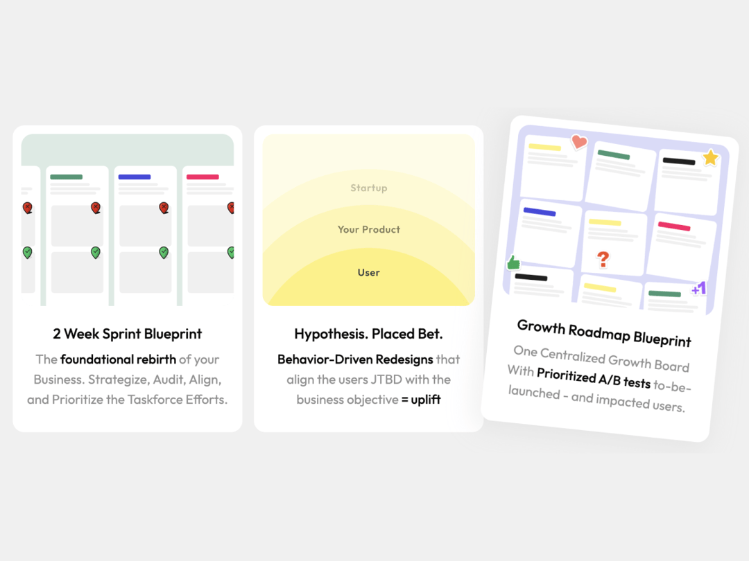
A simple FeatureCard with Hover Animations
Built with React and Tailwind. Copy the prompt and paste it into Claude Code, Cursor or Lovable: your agent adds FeatureCard to your project and fits it to your theme.
Code
How FeatureCard is used: the demo's code. The component's own source comes with a free account.
Usage.tsx
import FeatureCard from "@/components/ui/feature-card";

const cards = [
  {
    title:"Feature Card Component",
    description:"Ideal for Agencies or SaaS Companies that want a minimalistic approach to showcase benefits.",
    extraStyles:"hover:rotate-3",
  },
  {
    title:"Feature Card Component",
    description:"Ideal for Agencies or SaaS Companies that want a minimalistic approach to showcase benefits.",
    extraStyles:" hover:rotate-3"
  },
]

export default function DemoOne() {
  return (
    <main className="flex flex-wrap gap-4 items-center justify-center w-screen min-h-screen mx-auto bg-[#F0F0F0]">
      {cards.map((card, index) => (
      <FeatureCard
        key={index}
        title={card.title}
        description={card.description}
      />
      ))}
  </main>
  );
}
Dependencies
More by Radu Popescu
View all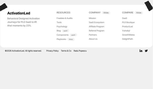

Footer Taped Design
544
Colorful Bento Grid
356
PricingSlider Loops
181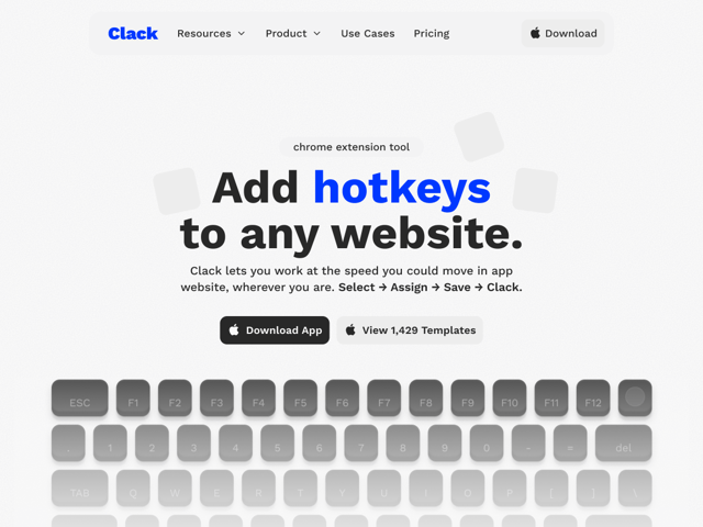
Simple Navigation with Icons
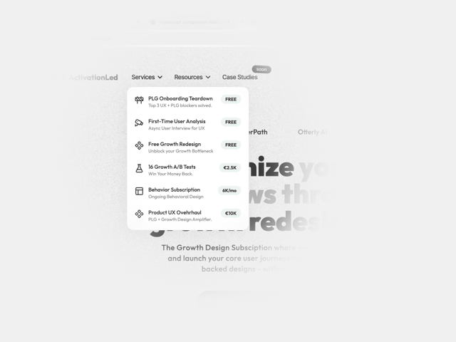
Navbar Custom Dropdown Button
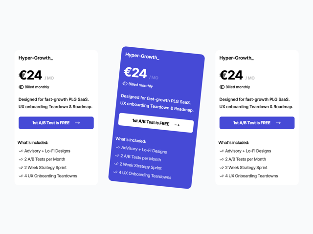
Pricing Plan Card With Toggle
Reviews Badge
Checkout Button
More in Features
View all

Features 8
3.1K
Features 2
322

Grid Feature Cards
1.9K

Feature Sections
52
Feature with advantages
278
Feature Section with card gradient
169
Feature Modern
17
Features 4
368


