
About
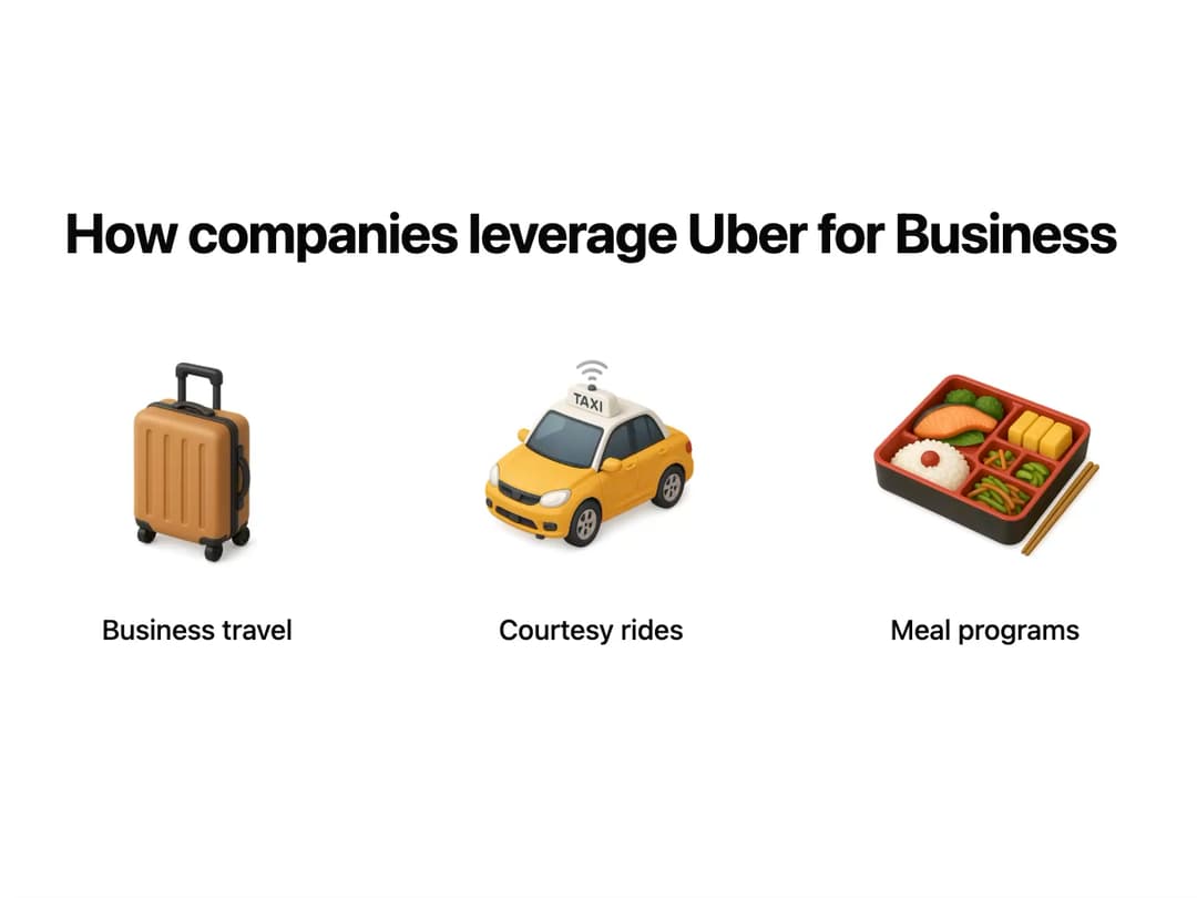
Business Features The BusinessFeatures component is designed to showcase a list of features or services in a clean, grid-based layout. It features a main title and a set of items, each represented by a circular image and a corresponding label. It includes a subtle, staggered fade-in animation for the feature items to enhance visual appeal as they enter the viewport.
Built with React and Tailwind. Copy the prompt and paste it into Claude Code, Cursor or Lovable: your agent adds Business Features to your project and fits it to your theme.
Code
How Business Features is used: the demo's code. The component's own source comes with a free account.
Usage.tsx
import React from "react";
import { BusinessFeatures } from "@/components/ui/business-features";

// Sample data for the demo
const uberFeatures = {
  title: "How companies leverage Uber for Business",
  features: [
    {
      imgSrc: "https://www.thiings.co/_next/image?url=https%3A%2F%2Flftz25oez4aqbxpq.public.blob.vercel-storage.com%2Fimage-SJxXSQiZvg2rhqvpw6hANLsmgfO4tX.png&w=1000&q=75",
      label: "Business travel",
      altText: "Illustration of a person with luggage at an airport",
    },
    {
      imgSrc: "https://www.thiings.co/_next/image?url=https%3A%2F%2Flftz25oez4aqbxpq.public.blob.vercel-storage.com%2Fimage-ECjjlDKoYtTyt2v4YWrAuIu31UYbmV.png&w=1000&q=75",
      label: "Courtesy rides",
      altText: "Illustration of a person wearing headphones in a car",
    },
    {
      imgSrc: "https://www.thiings.co/_next/image?url=https%3A%2F%2Flftz25oez4aqbxpq.public.blob.vercel-storage.com%2Fimage-g5x4D885dtv5R6gsLOR4xfwmaN8Vne.png&w=1000&q=75",
      label: "Meal programs",
      altText: "Illustration of food items being delivered",
    },
  ],
};

const BusinessFeaturesDemo = () => {
  return (
    <div className="w-full bg-background">
      <BusinessFeatures
        title={uberFeatures.title}
        features={uberFeatures.features}
      />
    </div>
  );
};

export default BusinessFeaturesDemo;
Dependencies
More by Ravi Katiyar
View all

Animated Shader Hero
3.7K
Hero
3.1K
Circular Gallery
2.7K
Minimalist Hero
2.5K
Floating Icons Hero Section
1.9K
Glass Calendar
1.8K
Feature Carousel
1.7K
AI Image Generator Hero
1.4K
More in Features
View all

Features 8
3.1K

Feature Sections
107

Grid Feature Cards
1.9K

Feature 72
122
Features 2
322
Features 4
368
Feature Modern
9
Features Card
201

