
About
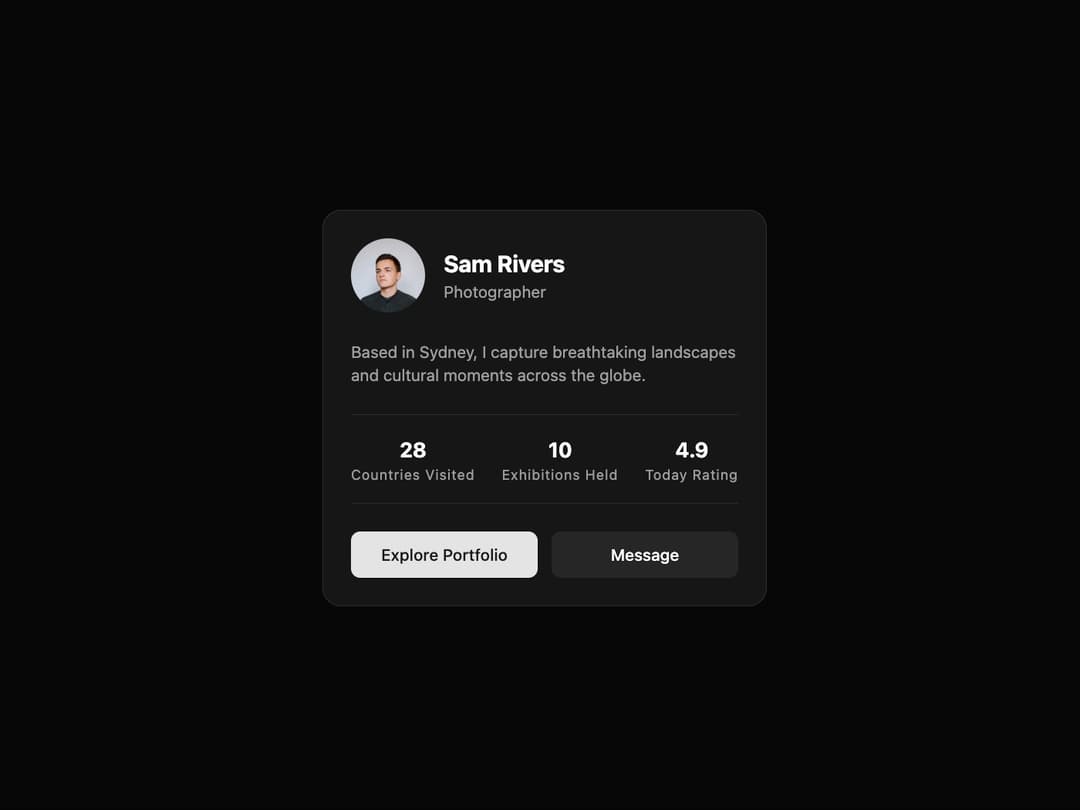
Profile Card A visually polished card component to display user profile information, including statistics and action buttons. It features a subtle entrance animation and adapts seamlessly to light and dark themes.
Built with React and Tailwind. Copy the prompt and paste it into Claude Code, Cursor or Lovable: your agent adds Card to your project and fits it to your theme.
Code
How Card is used: the demo's code. The component's own source comes with a free account.
Usage.tsx
import { ProfileCard } from "@/components/ui/card-5";

export default function ProfileCardDemo() {
  const userStats = [
    { label: "Countries Visited", value: 28 },
    { label: "Exhibitions Held", value: 10 },
    { label: "Today Rating", value: 4.9 },
  ];

  const userActions = [
    {
      label: "Explore Portfolio",
      variant: "default" as const, // Specify variant for styling
      onClick: () => alert("Exploring portfolio..."),
    },
    {
      label: "Message",
      variant: "secondary" as const,
      onClick: () => alert("Opening message..."),
    },
  ];

  return (
    <div className="flex min-h-[500px] w-full items-center justify-center bg-background p-4">
      <ProfileCard
        avatarSrc="https://cdn.21st.dev/assets/mirror/43/43d95f2384ae1da7afa92d96814b35d48e97402669d7a1d1333cbb5a0a5cbb85.jpg"
        name="Sam Rivers"
        handle="Photographer"
        bio="Based in Sydney, I capture breathtaking landscapes and cultural moments across the globe."
        stats={userStats}
        actions={userActions}
      />
    </div>
  );
}
Dependencies
More by Ravi Katiyar
View all

Animated Shader Hero
3.7K
Hero
3.1K
Circular Gallery
2.7K
Minimalist Hero
2.5K
Floating Icons Hero Section
1.9K
Glass Calendar
1.8K
Feature Carousel
1.7K
AI Image Generator Hero
1.4K
More in Buttons
View all

Button
14
Button
34
Texture Button
92
Button Save
46

Button
64

Button Group
3

App Store Button
454

Notification Button
103

