
About
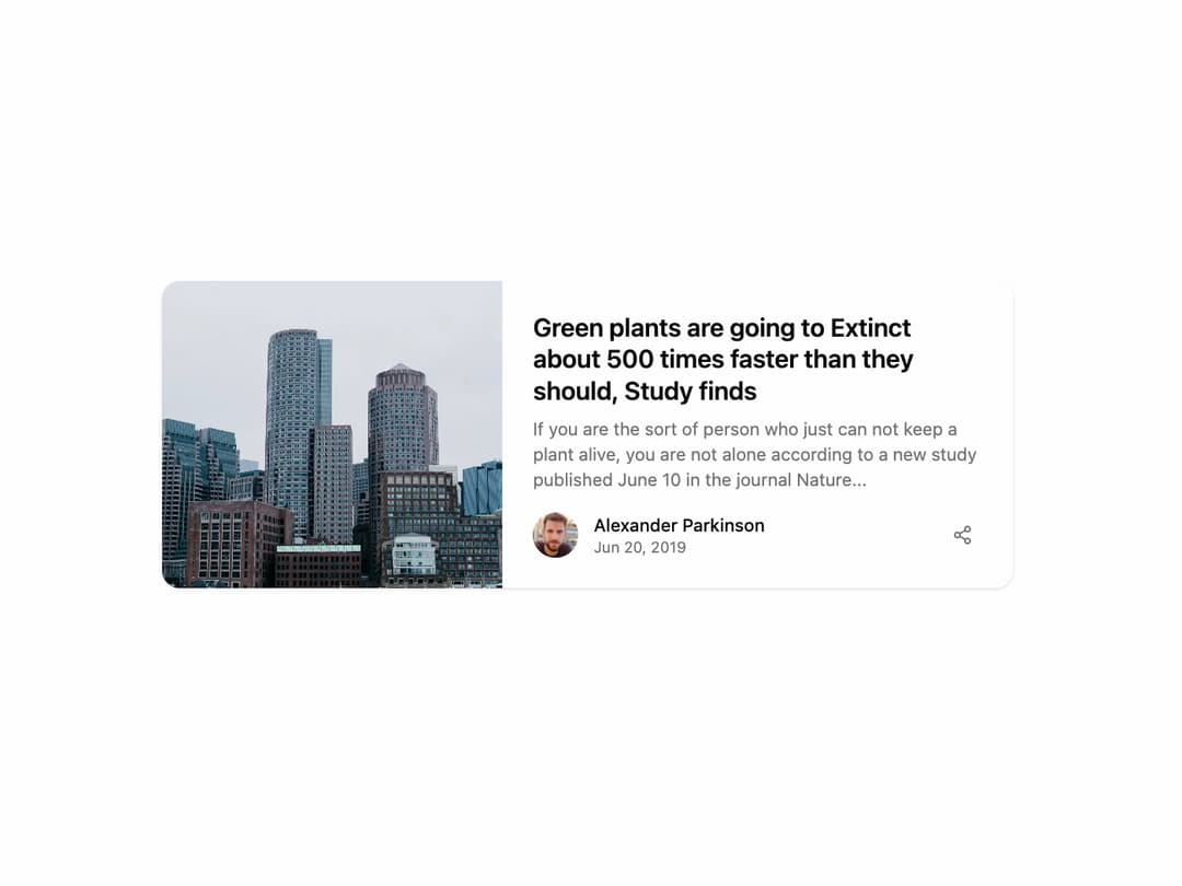
Article Card A responsive card component designed to display articles or blog posts, featuring an image, title, description, and author details. It adapts seamlessly to both light and dark themes.
Built with React and Tailwind. Copy the prompt and paste it into Claude Code, Cursor or Lovable: your agent adds Card to your project and fits it to your theme.
Code
How Card is used: the demo's code. The component's own source comes with a free account.
Usage.tsx
import { ArticleCard } from '@/components/ui/card-8'; // Adjust the import path

const ArticleCardDemo = () => {
  return (
    <div className="flex h-full w-full items-center justify-center bg-background p-4">
      <ArticleCard
        imageUrl="https://cdn.21st.dev/assets/mirror/9e/9ea9d78f44dfc0cb4e98d4424b6d0a25b15a268a261e4ab9307eb03f4eb85043.jpg"
        imageAlt="Close-up of code on a screen"
        title="Green plants are going to Extinct about 500 times faster than they should, Study finds"
        description="If you are the sort of person who just can not keep a plant alive, you are not alone according to a new study published June 10 in the journal Nature..."
        authorName="Alexander Parkinson"
        authorImageUrl="https://cdn.21st.dev/assets/mirror/a6/a634d4f02fe5b77804943c1d74b8d70e35ffe26454e0e9af9717432a2c72bfde.jpg"
        date="Jun 20, 2019"
        onShareClick={() => alert('Share functionality triggered!')}
        className="w-full"
      />
    </div>
  );
};

export default ArticleCardDemo;
Dependencies
More by Ravi Katiyar
View all

Animated Shader Hero
3.7K
Hero
3.1K
Circular Gallery
2.7K
Minimalist Hero
2.5K
Floating Icons Hero Section
1.9K
Glass Calendar
1.8K
Feature Carousel
1.7K
AI Image Generator Hero
1.4K
More in Cards
View all
Stats cards with links
33

Course Design Cards
1.1K

Card
70
Statistics Card 2
264
Statistics Card 10
263

Card
17

Card Studio
9
The Item one
3
