
About
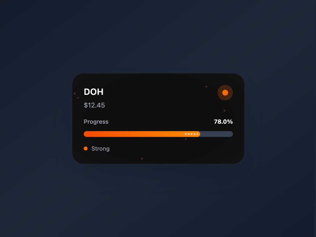
I crafted this sleek, dark-themed crypto performance card to bring data to life—featuring bold stats, smooth micro-animations, glowing accents, and a polished layout perfect for dashboards and fintech apps.
Built with React and Tailwind. Copy the prompt and paste it into Claude Code, Cursor or Lovable: your agent adds Crypto Performance Progress Card to your project and fits it to your theme.
Code
How Crypto Performance Progress Card is used: the demo's code. The component's own source comes with a free account.
Usage.tsx
import React, { useState, useEffect } from 'react';

const CryptoPriceCard = () => {
  const [isDark, setIsDark] = useState(false);

  useEffect(() => {
    const mediaQuery = window.matchMedia('(prefers-color-scheme: dark)');
    setIsDark(mediaQuery.matches);
    const handleChange = (e) => setIsDark(e.matches);
    mediaQuery.addEventListener('change', handleChange);
    return () => mediaQuery.removeEventListener('change', handleChange);
  }, []);

  const theme = {
    dark: {
      bg: 'from-gray-900 via-gray-800 to-gray-900',
      cardBg: 'from-gray-900/90 to-gray-800/90',
      border: 'border-gray-700/50',
      text: 'text-white',
      subtext: 'text-gray-400',
      progressBg: 'bg-gray-700',
      progressDOH: 'bg-gradient-to-r from-orange-600 to-orange-400',
      shadow: 'shadow-2xl shadow-gray-900/50',
      glow: 'shadow-orange-500/20',
    },
    light: {
      bg: 'from-blue-50 via-white to-purple-50',
      cardBg: 'from-white/95 to-gray-50/95',
      border: 'border-gray-200',
      text: 'text-gray-900',
      subtext: 'text-gray-600',
      progressBg: 'bg-gray-200',
      progressDOH: 'bg-gradient-to-r from-orange-500 to-amber-400',
      shadow: 'shadow-xl shadow-gray-300/30',
      glow: 'shadow-orange-300/40',
    }
  };

  const currentTheme = isDark ? theme.dark : theme.light;

  const AnimatedProgressBar = ({ progress, color, delay = 0 }) => {
    const [animated, setAnimated] = useState(false);

    useEffect(() => {
      const timer = setTimeout(() => setAnimated(true), delay);
      return () => clearTimeout(timer);
    }, [delay]);

    return (
      <div className={`relative h-3 rounded-full overflow-hidden ${currentTheme.progressBg} backdrop-blur-sm`}>
        <div
          className={`absolute inset-y-0 left-0 rounded-full transition-all duration-2000 ease-out ${color} ${animated ? currentTheme.glow : ''}`}
          style={{
            width: animated ? `${progress}%` : '0%',
            transition: 'width 2s cubic-bezier(0.4, 0, 0.2, 1)'
          }}
        >
          <div className="absolute inset-0 bg-gradient-to-r from-transparent via-white/20 to-transparent transform -skew-x-12 animate-shimmer"></div>
          <div className="absolute inset-0 flex items-center justify-end pr-1">
            <div className="flex space-x-0.5">
              {[...Array(Math.floor(progress / 15))].map((_, i) => (
                <div
                  key={i}
                  className="w-1 h-1 bg-white/60 rounded-full animate-pulse"
                  style={{ animationDelay: `${i * 0.1}s` }}
                />
              ))}
            </div>
          </div>
        </div>
      </div>
    );
  };

  const PriceCard = ({ title, price, progress, delay }) => {
    const [isHovered, setIsHovered] = useState(false);

    return (
      <div
        className={`
          relative p-6 w-90 rounded-3xl backdrop-blur-xl border transition-all duration-500 ease-out
          ${currentTheme.cardBg} ${currentTheme.border} ${currentTheme.shadow}
          hover:scale-105 hover:${currentTheme.glow}
          transform-gpu cursor-pointer group
        `}
        onMouseEnter={() => setIsHovered(true)}
        onMouseLeave={() => setIsHovered(false)}
        style={{
          background: isDark
            ? `radial-gradient(67.3% 77.6% at 50% 50%, rgb(15, 15, 16) 61.72%, rgb(19, 19, 22) 100%)`
            : `radial-gradient(67.3% 77.6% at 50% 50%, rgba(255, 255, 255, 0.9) 61.72%, rgba(248, 250, 252, 0.9) 100%)`
        }}
      >
        <div className="absolute inset-0 overflow-hidden rounded-3xl">
          {[...Array(6)].map((_, i) => (
            <div
              key={i}
              className="absolute w-1 h-1 rounded-full opacity-20 animate-float bg-orange-400"
              style={{
                left: `${Math.random() * 100}%`,
                top: `${Math.random() * 100}%`,
                animationDelay: `${i * 0.5}s`,
                animationDuration: `${3 + Math.random() * 2}s`
              }}
            />
          ))}
        </div>

        <div className="relative z-10 space-y-4">
          <div className="flex justify-between items-start">
            <div>
              <h3 className={`text-lg font-semibold tracking-wide ${currentTheme.text}`}>
                {title}
              </h3>
              <p className={`text-sm mt-1 ${currentTheme.subtext}`}>
                ${price}
              </p>
            </div>
            <div className="w-8 h-8 rounded-full flex items-center justify-center bg-orange-500/20 group-hover:scale-110 group-hover:rotate-12 transition-all">
              <div className="w-3 h-3 bg-orange-500 rounded-full animate-pulse" />
            </div>
          </div>

          <div className="space-y-3">
            <div className="flex justify-between items-center">
              <span className={`text-xs font-medium ${currentTheme.subtext}`}>Progress</span>
              <span className={`text-xs font-bold ${currentTheme.text}`}>{progress.toFixed(1)}%</span>
            </div>
            <AnimatedProgressBar progress={progress} color={currentTheme.progressDOH} delay={delay} />
          </div>

          <div className="flex items-center space-x-2">
            <div className="w-2 h-2 rounded-full animate-pulse bg-orange-500" />
            <span className={`text-xs ${currentTheme.subtext}`}>
              {progress > 50 ? 'Strong' : 'Moderate'}
            </span>
          </div>
        </div>
      </div>
    );
  };

  return (
    <div className={`min-h-screen w-full flex items-center justify-center bg-gradient-to-br ${currentTheme.bg} p-8`}>
      <PriceCard title="DOH" price="12.45" progress={78} delay={200} />

      <style jsx>{`
        @keyframes shimmer {
          0% { transform: translateX(-100%) skewX(-12deg); }
          100% { transform: translateX(200%) skewX(-12deg); }
        }
        @keyframes float {
          0%, 100% { transform: translateY(0px) rotate(0deg); }
          50% { transform: translateY(-10px) rotate(180deg); }
        }
        .animate-shimmer {
          animation: shimmer 2s infinite;
        }
        .animate-float {
          animation: float 3s ease-in-out infinite;
        }
      `}</style>
    </div>
  );
};

export default CryptoPriceCard;
Dependencies
More by Ravi Katiyar
View all

Animated Shader Hero
3.7K
Hero
3.1K
Circular Gallery
2.7K
Minimalist Hero
2.5K
Floating Icons Hero Section
1.9K
Glass Calendar
1.8K
Feature Carousel
1.7K
AI Image Generator Hero
1.4K
More in Cards
View all
Stats cards with links
33

Course Design Cards
1.1K

Card
70
Statistics Card 2
264
Statistics Card 10
263

Card
17

Card Studio
9
The Item one
3
