
About
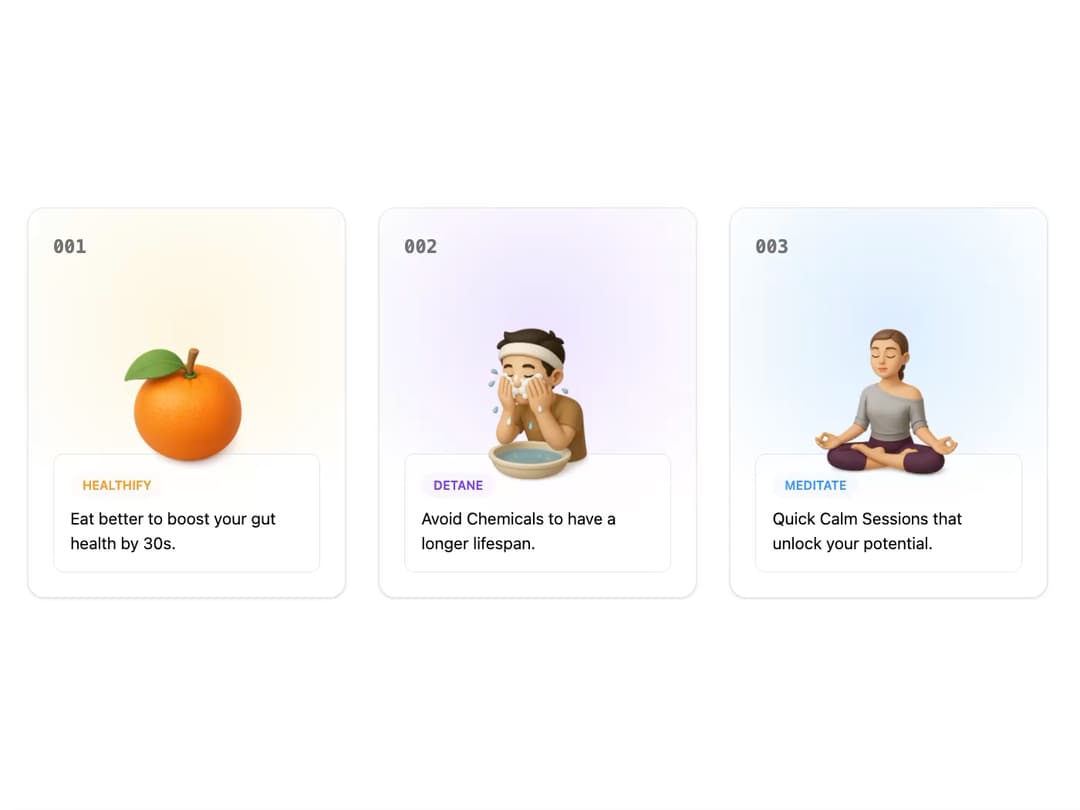
Animated Feature Card This component displays a feature or benefit in a visually engaging card format. It's designed to be highly reusable, accepting props for its content, image, and color theme. The hover animation, powered by framer-motion, adds a delightful interactive element.
Built with React and Tailwind. Copy the prompt and paste it into Claude Code, Cursor or Lovable: your agent adds Feature Card to your project and fits it to your theme.
Code
How Feature Card is used: the demo's code. The component's own source comes with a free account.
Usage.tsx
import { AnimatedFeatureCard } from "@/components/ui/feature-card-1";

// Data for the feature cards
const features = [
  {
    index: "001",
    tag: "HEALTHIFY",
    title: "Eat better to boost your gut health by 30s.",
    imageSrc: "https://www.thiings.co/_next/image?url=https%3A%2F%2Flftz25oez4aqbxpq.public.blob.vercel-storage.com%2Fimage-79XLKwCuOZGHdVcOlEApISx6x2nVd2.png&w=1000&q=75", // Replace with your image URL
    color: "orange" as const,
  },
  {
    index: "002",
    tag: "DETANE",
    title: "Avoid Chemicals to have a longer lifespan.",
    imageSrc: "https://www.thiings.co/_next/image?url=https%3A%2F%2Flftz25oez4aqbxpq.public.blob.vercel-storage.com%2Fimage-DtOMYxIaV2eptIhXTkorEzdNzhlgXK.png&w=1000&q=75", // Replace with your image URL
    color: "purple" as const,
  },
  {
    index: "003",
    tag: "MEDITATE",
    title: "Quick Calm Sessions that unlock your potential.",
    imageSrc: "https://www.thiings.co/_next/image?url=https%3A%2F%2Flftz25oez4aqbxpq.public.blob.vercel-storage.com%2Fimage-eDCSln4vQRsBBiP3mWirJOXYDyFO6q.png&w=1000&q=75", // Replace with your image URL
    color: "blue" as const,
  },
];

export default function FeatureCardDemo() {
  return (
    <div className="flex min-h-screen w-full items-center justify-center bg-background">
      <div className="container mx-auto grid max-w-5xl grid-cols-1 gap-8 p-4 md:grid-cols-2 lg:grid-cols-3">
        {features.map((feature) => (
          <AnimatedFeatureCard
            key={feature.index}
            index={feature.index}
            tag={feature.tag}
            title={feature.title}
            imageSrc={feature.imageSrc}
            color={feature.color}
          />
        ))}
      </div>
    </div>
  );
}
Dependencies
More by Ravi Katiyar
View all

Animated Shader Hero
3.7K
Hero
3.1K
Circular Gallery
2.7K
Minimalist Hero
2.5K
Floating Icons Hero Section
1.9K
Glass Calendar
1.8K
Feature Carousel
1.7K
AI Image Generator Hero
1.4K
More in Features
View all

Features 8
3.1K

Feature Sections
107

Feature 72
122

Grid Feature Cards
1.9K
Features 2
322
Features 4
368
Feature Modern
9
Features Card
201

