
About
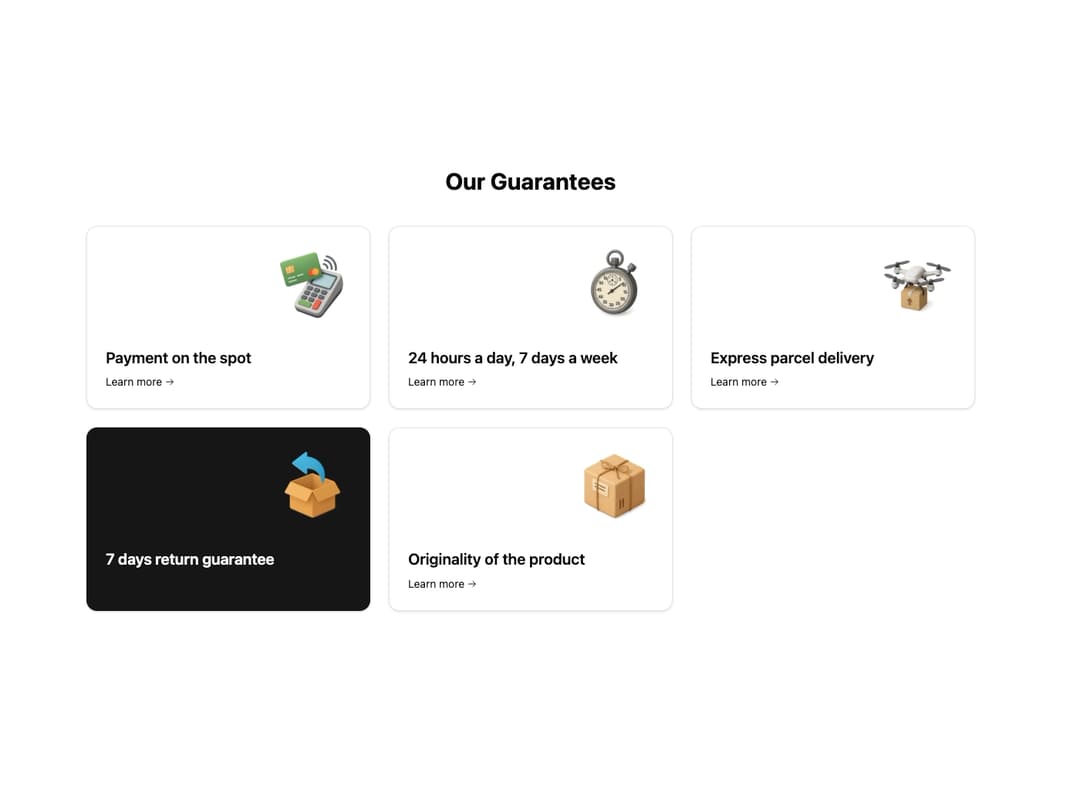
Built with React and Tailwind. Copy the prompt and paste it into Claude Code, Cursor or Lovable: your agent adds Feature Card 11 to your project and fits it to your theme.
Code
How Feature Card 11 is used: the demo's code. The component's own source comes with a free account.
Usage.tsx
import { FeatureCard } from "@/components/ui/feature-card-11"
import { cn } from "@/lib/utils"

// Define the data structure for the cards
interface Feature {
  title: string
  imageSrc: string
  href: string
  isHighlighted?: boolean // To handle the distinct green card
}

const FEATURE_DATA: Feature[] = [
  {
    title: "Payment on the spot",
    imageSrc: "https://www.thiings.co/_next/image?url=https%3A%2F%2Flftz25oez4aqbxpq.public.blob.vercel-storage.com%2Fimage-LB1YlMnPouzDHgdbPYBmSk0IWXZEvb.png&w=1000&q=75", // Placeholder image link
    href: "#",
  },
  {
    title: "24 hours a day, 7 days a week",
    imageSrc: "https://www.thiings.co/_next/image?url=https%3A%2F%2Flftz25oez4aqbxpq.public.blob.vercel-storage.com%2Fimage-VssSUjp7tvqQZndCA7aaNBblydpBgj.png&w=1000&q=75", // Placeholder image link
    href: "#",
  },
  {
    title: "Express parcel delivery",
    imageSrc: "https://www.thiings.co/_next/image?url=https%3A%2F%2Flftz25oez4aqbxpq.public.blob.vercel-storage.com%2Fimage-vB3yCpbqsZG8AszLPHliTtHLMv24hJ.png&w=1000&q=75", // Placeholder image link
    href: "#",
  },
  {
    title: "7 days return guarantee",
    imageSrc: "https://www.thiings.co/_next/image?url=https%3A%2F%2Flftz25oez4aqbxpq.public.blob.vercel-storage.com%2Fimage-fzgqXK8IdRwAeKAE2mKLO0kyQVLi9U.png&w=1000&q=75", // Placeholder image link
    href: "#",
    isHighlighted: true, // The distinct green card
  },
  {
    title: "Originality of the product",
    imageSrc: "https://www.thiings.co/_next/image?url=https%3A%2F%2Flftz25oez4aqbxpq.public.blob.vercel-storage.com%2Fimage-cfG5HFRLtZ568wRFDk8NRn7hzW00fY.png&w=1000&q=75", // Placeholder image link
    href: "#",
  },
]

// Advanced CSS for the demo: Tilt and Shadow hover effect
const ADVANCED_HOVER_CLASSES = cn(
  "transition-all duration-500 ease-in-out",
  "hover:shadow-2xl hover:shadow-primary/30",
  "hover:scale-[1.02]", // Subtle scale up
  "hover:-translate-y-1" // Lift effect
)

// Define the Demo component
export default function FeatureGridDemo() {
  return (
    <div className="w-full max-w-6xl mx-auto py-12">
      <h2 className="text-3xl font-bold text-center mb-10">Our Guarantees</h2>

      {/* Responsive Grid Layout */}
      <div className="grid grid-cols-1 sm:grid-cols-2 lg:grid-cols-3 gap-6">
        {FEATURE_DATA.map((feature, index) => (
          <FeatureCard
            key={index}
            title={feature.title}
            imageSrc={feature.imageSrc}
            href={feature.href}
            // Apply a unique style for the highlighted card
            className={cn(
              ADVANCED_HOVER_CLASSES,
              feature.isHighlighted
                ? "bg-primary text-primary-foreground border-primary"
                : "bg-card text-card-foreground" // Ensure theme variables are used
            )}
          />
        ))}
      </div>
    </div>
  )
}More by Ravi Katiyar
View all

Animated Shader Hero
3.7K
Hero
3.1K
Circular Gallery
2.7K
Minimalist Hero
2.5K
Floating Icons Hero Section
1.9K
Glass Calendar
1.8K
Feature Carousel
1.7K
AI Image Generator Hero
1.4K
More in Features
View all

Features 8
3.1K

Feature Sections
107

Grid Feature Cards
1.9K

Feature 72
122
Features 2
322
Features 4
368
Feature Modern
9
Features Card
201

