
About
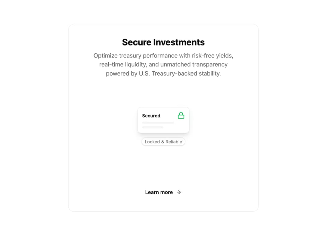
Animated Feature Card This component is designed to highlight a key feature in a visually engaging way. It includes a title, description, a call-to-action button, and a central animated graphic with a pulsating icon to draw user attention. It's built to be easily reused with different content by simply passing props.
Built with React and Tailwind. Copy the prompt and paste it into Claude Code, Cursor or Lovable: your agent adds Feature Card to your project and fits it to your theme.
Code
How Feature Card is used: the demo's code. The component's own source comes with a free account.
Usage.tsx
// demo.tsx

import { AnimatedFeatureCard } from '@/components/ui/feature-card-2';
import { Lock } from 'lucide-react'; // Using lucide-react for the icon

const FeatureCardDemo = () => {
  return (
    <div className="flex h-full min-h-screen w-full items-center justify-center bg-background p-4">
      <AnimatedFeatureCard
        title="Secure Investments"
        description="Optimize treasury performance with risk-free yields, real-time liquidity, and unmatched transparency powered by U.S. Treasury-backed stability."
        buttonText="Learn more"
        buttonHref="#"
        Icon={Lock} // Pass the Lock icon component
      />
    </div>
  );
};

export default FeatureCardDemo;
Dependencies
More by Ravi Katiyar
View all

Animated Shader Hero
3.7K
Hero
3.1K
Circular Gallery
2.7K
Minimalist Hero
2.5K
Floating Icons Hero Section
1.9K
Glass Calendar
1.8K
Feature Carousel
1.7K
AI Image Generator Hero
1.4K
More in Features
View all

Features 8
3.1K

Feature Sections
107

Grid Feature Cards
1.9K

Feature 72
122
Features 2
322
Features 4
368
Feature Modern
9
Features Card
201

