
About
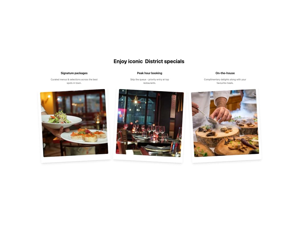
Feature Polaroid Section This component displays a title and a grid of features. Each feature is presented with a title, a description, and a tilted polaroid-style image that animates on hover. The entire section animates into view with a staggered effect.
Built with React and Tailwind. Copy the prompt and paste it into Claude Code, Cursor or Lovable: your agent adds Feature Polaroid Section to your project and fits it to your theme.
Code
How Feature Polaroid Section is used: the demo's code. The component's own source comes with a free account.
Usage.tsx
import { FeaturePolaroidSection, Feature } from "@/components/ui/feature-polaroid-section";

// Sample data for the features
const featuresData: Feature[] = [
  {
    title: "Signature packages",
    description: "Curated menus & selections across the best spots in town.",
    imageSrc: "https://cdn.21st.dev/assets/mirror/fe/feb07c5c31a2f45ca6e4dfea6ea6167a3c427a5815b527f87cdd1897d7737aab.jpg",
    imageAlt: "Group of friends dining together",
  },
  {
    title: "Peak hour booking",
    description: "Skip the queue - priority entry at top restaurants.",
    imageSrc: "https://cdn.21st.dev/assets/mirror/97/9730c4bde416fa3cb76949bdf7a7cef84da66d4e16405af2143bc075835189d0.jpg",
    imageAlt: "Couple having a drink at a bar",
  },
  {
    title: "On-the-house",
    description: "Complimentary delights along with your favourite meals.",
    imageSrc: "https://cdn.21st.dev/assets/mirror/a7/a706f9c39c3fee134ba2582329d3755e015d774ce716eeae27675e34d5c9ada0.jpg",
    imageAlt: "Friends toasting with drinks over a large meal",
  },
];

// SVG component for the decorative underline
const Underline = () => (
  <svg
    className="absolute left-0 top-full w-full h-3"
    viewBox="0 0 196 12"
    fill="none"
    xmlns="http://www.w3.org/2000/svg"
    preserveAspectRatio="none"
  >
    <path
      d="M2 9.75184C32.0084 4.50095 106.326 -2.49905 194 9.75184"
      stroke="hsl(var(--primary))"
      strokeWidth="4"
      strokeLinecap="round"
    />
  </svg>
);


export default function FeaturePolaroidSectionDemo() {
  // Custom title with the styled underline, passed as a ReactNode
  const customTitle = (
    <>
      Enjoy iconic{" "}
      <span className="relative inline-block px-2">
        District specials
        <Underline />
      </span>
    </>
  );

  return (
    <div className="w-full bg-background">
      <FeaturePolaroidSection title={customTitle} features={featuresData} />
    </div>
  );
}
Dependencies
More by Ravi Katiyar
View all

Animated Shader Hero
3.7K
Hero
3.1K
Circular Gallery
2.7K
Minimalist Hero
2.5K
Floating Icons Hero Section
1.9K
Glass Calendar
1.8K
Feature Carousel
1.7K
AI Image Generator Hero
1.4K
More in Features
View all

Features 8
3.1K

Feature Sections
107

Grid Feature Cards
1.9K

Feature 72
122
Features 2
322
Features 4
368
Feature Modern
9
Features Card
201

