
About
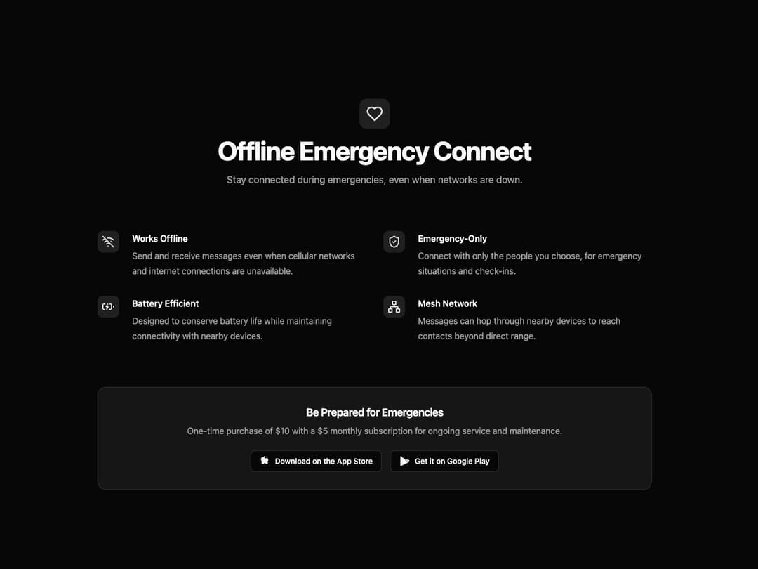
Feature Section A responsive and theme-adaptive component designed to showcase a product's key features. It includes a main title, a subtitle, a grid of features with icons, and a final call-to-action card. It's built to be highly reusable by accepting all content through props.
Built with React and Tailwind. Copy the prompt and paste it into Claude Code, Cursor or Lovable: your agent adds Feature Section to your project and fits it to your theme.
Code
How Feature Section is used: the demo's code. The component's own source comes with a free account.
Usage.tsx
"use client" // Required for Framer Motion

import {
  Heart,
  WifiOff,
  ShieldCheck,
  BatteryCharging,
  Network,
} from "lucide-react"
import { motion } from "framer-motion"
import { FeatureSection } from "@/components/ui/feature-section-1"

// Animation variants for the container and items
const containerVariants = {
  hidden: { opacity: 0 },
  visible: {
    opacity: 1,
    transition: {
      staggerChildren: 0.1,
    },
  },
}

const itemVariants = {
  hidden: { y: 20, opacity: 0 },
  visible: {
    y: 0,
    opacity: 1,
    transition: {
      duration: 0.5,
      ease: "easeInOut",
    },
  },
}

export default function FeatureSectionDemo() {
  // Define the data to be passed into the component
  const featureData = {
    mainIcon: <Heart className="h-8 w-8" />,
    title: "Offline Emergency Connect",
    subtitle: "Stay connected during emergencies, even when networks are down.",
    features: [
      {
        icon: <WifiOff className="h-6 w-6" />,
        title: "Works Offline",
        description:
          "Send and receive messages even when cellular networks and internet connections are unavailable.",
      },
      {
        icon: <ShieldCheck className="h-6 w-6" />,
        title: "Emergency-Only",
        description:
          "Connect with only the people you choose, for emergency situations and check-ins.",
      },
      {
        icon: <BatteryCharging className="h-6 w-6" />,
        title: "Battery Efficient",
        description:
          "Designed to conserve battery life while maintaining connectivity with nearby devices.",
      },
      {
        icon: <Network className="h-6 w-6" />,
        title: "Mesh Network",
        description:
          "Messages can hop through nearby devices to reach contacts beyond direct range.",
      },
    ],
    callToAction: {
      title: "Be Prepared for Emergencies",
      description:
        "One-time purchase of $10 with a $5 monthly subscription for ongoing service and maintenance.",
      appleUrl: "#",
      googleUrl: "#",
    },
  }

  return (
    // Wrap the component with motion.div for animations
    <motion.div initial="hidden" animate="visible" variants={containerVariants}>
      <motion.div variants={itemVariants}>
        <FeatureSection {...featureData} />
      </motion.div>
    </motion.div>
  )
}More by Ravi Katiyar
View all

Animated Shader Hero
3.7K
Hero
3.1K
Circular Gallery
2.7K
Minimalist Hero
2.5K
Floating Icons Hero Section
1.9K
Glass Calendar
1.8K
Feature Carousel
1.7K
AI Image Generator Hero
1.4K
More in Features
View all

Features 8
3.1K
Features 2
322

Grid Feature Cards
1.9K

Feature Sections
52
Feature with advantages
278
Feature Section with card gradient
169
Feature Modern
17
Features 4
368


