
About
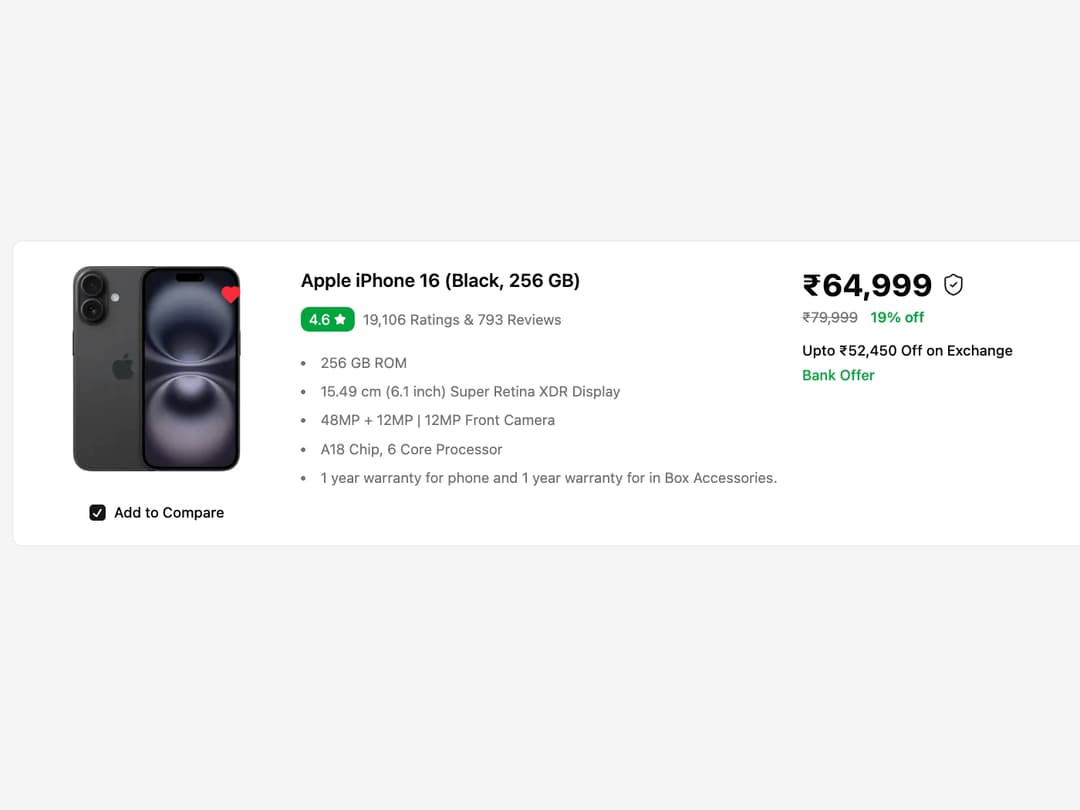
Product Card This reusable card component displays product information, including an image, title, ratings, specifications, and pricing details in a responsive layout.
Built with React and Tailwind. Copy the prompt and paste it into Claude Code, Cursor or Lovable: your agent adds Product Card to your project and fits it to your theme.
Code
How Product Card is used: the demo's code. The component's own source comes with a free account.
Usage.tsx
import { ProductCard } from "@/components/ui/product-card-1";

// Sample data for the product card
const productData = {
  imageUrl: "https://cdn.21st.dev/assets/mirror/96/966ae65cf8963cdcf9262c1f5b85b6102b05b22c0d0ed4f226000bf83d260103.jpg", // Placeholder image link
  title: "Apple iPhone 16 (Black, 256 GB)",
  rating: 4.6,
  ratingsCount: 19106,
  reviewsCount: 793,
  specifications: [
    "256 GB ROM",
    "15.49 cm (6.1 inch) Super Retina XDR Display",
    "48MP + 12MP | 12MP Front Camera",
    "A18 Chip, 6 Core Processor",
    "1 year warranty for phone and 1 year warranty for in Box Accessories.",
  ],
  price: 64999,
  originalPrice: 79999,
  isAssured: true,
  exchangeOffer: "52,450",
  bankOffer: "Bank Offer",
};

export default function ProductCardDemo() {
  return (
    <div className="flex items-center justify-center min-h-screen bg-muted p-4">
      <ProductCard {...productData} />
    </div>
  );
}
Dependencies
More by Ravi Katiyar
View all

Animated Shader Hero
3.7K
Hero
3.1K
Circular Gallery
2.7K
Minimalist Hero
2.5K
Floating Icons Hero Section
1.9K
Glass Calendar
1.8K
Feature Carousel
1.7K
AI Image Generator Hero
1.4K
More in Pricing
View all
Pricing Section
582

Pricing Section
173

Pricing Card
365
pricing section
158

Pricing Cards
86
Colorful-Pricing
85
Glowing Pricing Tiers
45

RuixenPricing05
102


