
About
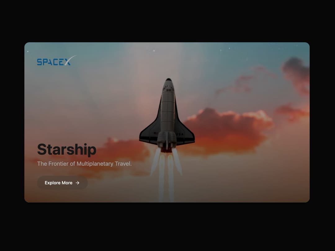
StarshipCard Component This component is a self-contained, animated card. It uses framer-motion for smooth animations and is styled with Tailwind CSS, adhering to shadcn/ui theme variables for perfect light/dark mode compatibility.
Built with React and Tailwind. Copy the prompt and paste it into Claude Code, Cursor or Lovable: your agent adds StarshipCard Component to your project and fits it to your theme.
Code
How StarshipCard Component is used: the demo's code. The component's own source comes with a free account.
Usage.tsx
import { StarshipCard } from "@/components/ui/starship-card-component"; // Adjust the import path as needed

/**
 * A demo page to showcase the StarshipCard component.
 */
export default function StarshipCardDemo() {
  return (
    <div className="flex h-[100vh] w-full items-center justify-center bg-background p-4 md:p-8">
      <StarshipCard
        logoSrc="https://upload.wikimedia.org/wikipedia/commons/thumb/d/de/SpaceX-Logo.svg/2560px-SpaceX-Logo.svg.png" // White SpaceX logo
        imageSrc="https://cdn.21st.dev/assets/mirror/52/52ec80afaa8f92a8323b095ee56eb9093e85cd1df912c8ab2bf64d07da5b5b50.jpg"
        title="Starship"
        description="The Frontier of Multiplanetary Travel."
        buttonText="Explore More"
        buttonLink="#"
      />
    </div>
  );
}
Dependencies
More by Ravi Katiyar
View all

Animated Shader Hero
3.7K
Hero
3.1K
Circular Gallery
2.7K
Minimalist Hero
2.5K
Floating Icons Hero Section
1.9K
Glass Calendar
1.8K
Feature Carousel
1.7K
AI Image Generator Hero
1.4K
More in Cards
View all
Stats cards with links
33

Course Design Cards
1.1K

Card
70
Statistics Card 2
264
Statistics Card 10
263

Card
17

Card Studio
9
The Item one
3
