
About
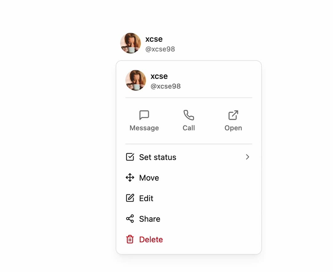
UserProfileDropdown Component This component displays a user's avatar and details, along with a dropdown menu containing customizable actions.
Built with React and Tailwind. Copy the prompt and paste it into Claude Code, Cursor or Lovable: your agent adds User Profile Dropdown to your project and fits it to your theme.
Code
How User Profile Dropdown is used: the demo's code. The component's own source comes with a free account.
Usage.tsx
import {
  MessageSquare,
  Phone,
  ExternalLink,
  Edit,
  Share2,
  Trash2,
  Move,
  CheckSquare,
} from 'lucide-react';
import { UserProfileDropdown } from '@/components/ui/user-profile-dropdown'; // Adjust the import path

// Dummy functions for demo purposes
const handleAction = (action: string) => alert(`Action: ${action}`);

const Demo = () => {
  // Define sample data using the types from the component
  const user = {
    name: 'xcse',
    handle: '@xcse98',
    avatarUrl: 'https://cdn.21st.dev/assets/mirror/ff/ff4b0fe2f7d11aff0d68f760e5fdcfeebf8b884c024ae24c9a6cf1d2edf76f49.jpg', // Replace with a real image link
  };

  const actions = [
    { icon: MessageSquare, label: 'Message', onClick: () => handleAction('Message') },
    { icon: Phone, label: 'Call', onClick: () => handleAction('Call') },
    { icon: ExternalLink, label: 'Open', onClick: () => handleAction('Open') },
  ];

  const menuItems = [
    { icon: CheckSquare, label: 'Set status', onClick: () => handleAction('Set status'), hasArrow: true },
    { icon: Move, label: 'Move', onClick: () => handleAction('Move') },
    { icon: Edit, label: 'Edit', onClick: () => handleAction('Edit') },
    { icon: Share2, label: 'Share', onClick: () => handleAction('Share') },
    { icon: Trash2, label: 'Delete', onClick: () => handleAction('Delete'), isDestructive: true },
  ];

  return (
    <div className="flex h-[450px] w-full items-start justify-center bg-background p-10">
      <UserProfileDropdown
        user={user}
        actions={actions}
        menuItems={menuItems}
      />
    </div>
  );
};

export default Demo;
Dependencies
More by Ravi Katiyar
View all

Animated Shader Hero
3.7K
Hero
3.1K
Circular Gallery
2.7K
Minimalist Hero
2.5K
Floating Icons Hero Section
1.9K
Glass Calendar
1.8K
Feature Carousel
1.7K
AI Image Generator Hero
1.4K
More in Buttons
View all

Button
14
Button
34
Texture Button
92
Button Save
46

Button
64

Button Group
3

App Store Button
454

Notification Button
103

