About
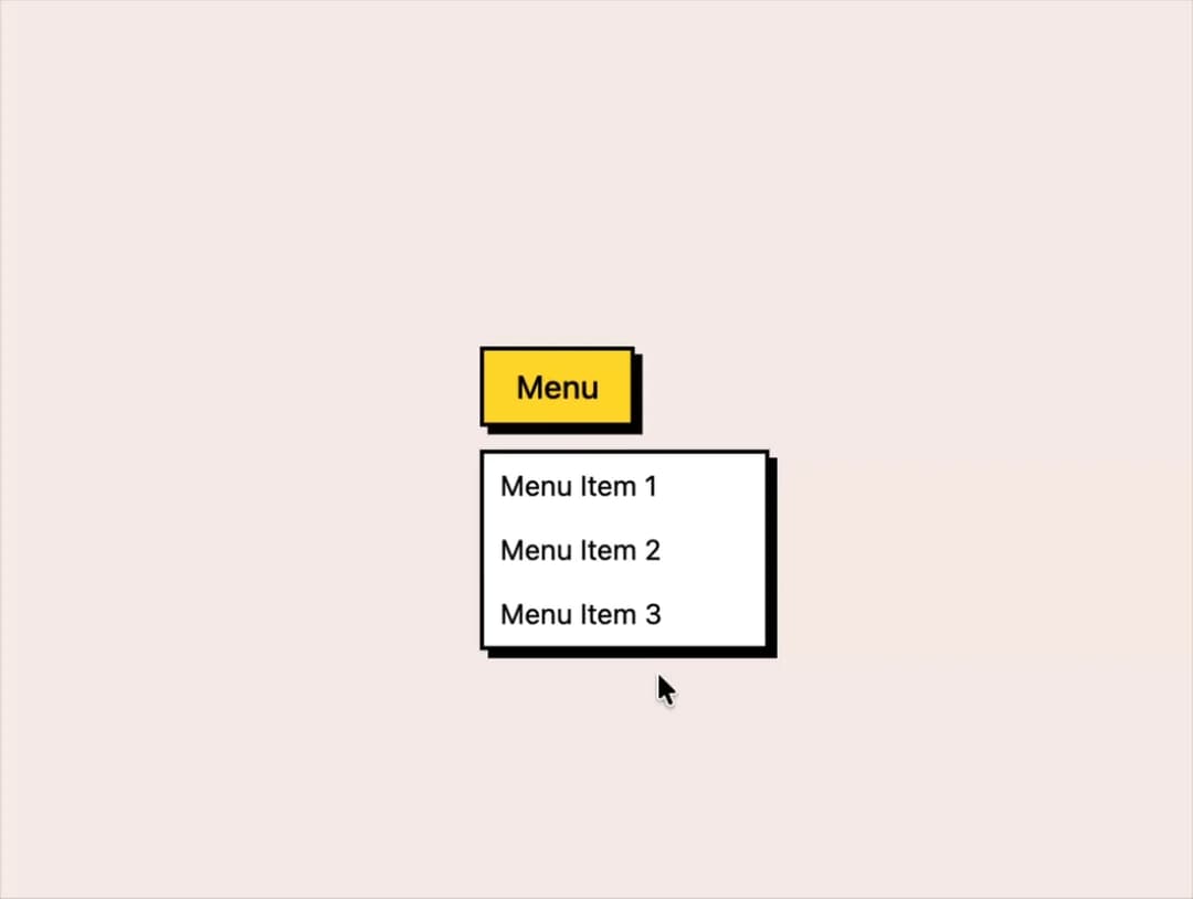
Dropdown menu that displays a list of actions a user can trigger from a button, built on Base UI with a neobrutalist retro style.
Built with React and Tailwind. Copy the prompt and paste it into Claude Code, Cursor or Lovable: your agent adds Menu to your project and fits it to your theme.
Code
How Menu is used: the demo's code. The component's own source comes with a free account.
Usage.tsx
"use client";

import { Menu } from "@/components/ui/menu-style-default";
import { cn } from "@/lib/utils";
import { cva, type VariantProps } from "class-variance-authority";
import React, { ButtonHTMLAttributes } from "react";
import { Button as BaseButton } from "@base-ui/react/button";

const buttonVariants = cva(
  "font-head transition-all rounded cursor-pointer duration-200 font-medium flex justify-center items-center disabled:opacity-60 disabled:cursor-not-allowed focus-visible:outline-2 focus-visible:outline-offset-2 focus-visible:outline-primary",
  {
    variants: {
      variant: {
        default:
          "shadow-md hover:shadow active:shadow-none bg-primary text-primary-foreground border-2 border-black transition hover:translate-y-1 active:translate-y-2 active:translate-x-1 hover:bg-primary-hover",
        secondary:
          "shadow-md hover:shadow active:shadow-none bg-secondary shadow-primary text-secondary-foreground border-2 border-black transition hover:translate-y-1 active:translate-y-2 active:translate-x-1 hover:bg-secondary-hover",
        outline:
          "shadow-md hover:shadow active:shadow-none bg-transparent border-2 transition hover:translate-y-1 active:translate-y-2 active:translate-x-1",
        link: "bg-transparent hover:underline",
        ghost: "bg-transparent hover:bg-accent",
      },
      size: {
        sm: "px-3 py-1 text-sm shadow hover:shadow-sm",
        md: "px-4 py-1.5 text-base",
        lg: "px-6 lg:px-8 py-2 lg:py-3 text-md lg:text-lg",
        icon: "p-2",
      },
    },
    defaultVariants: { size: "md", variant: "default" },
  },
);

interface IButtonProps
  extends
    ButtonHTMLAttributes<HTMLButtonElement>,
    VariantProps<typeof buttonVariants> {
  render?:
    React.ReactElement | ((props: Record<string, any>) => React.ReactElement);
}

const Button = ({
  children,
  size = "md",
  className = "",
  variant = "default",
  render,
  ref,
  ...props
}: IButtonProps & { ref?: React.Ref<HTMLButtonElement> }) => {
  return (
    <BaseButton
      ref={ref}
      className={cn(buttonVariants({ variant, size }), className)}
      render={render}
      {...props}
    >
      {children}
    </BaseButton>
  );
};

export default function MenuDefault() {
  return (
    <Menu>
      <Menu.Trigger>
        <Button>Menu</Button>
      </Menu.Trigger>
      <Menu.Content className="min-w-36">
        <Menu.Item>Menu Item 1</Menu.Item>
        <Menu.Item>Menu Item 2</Menu.Item>
        <Menu.Item>Menu Item 3</Menu.Item>
      </Menu.Content>
    </Menu>
  );
}
Dependencies
More by retroui
View all

Table
12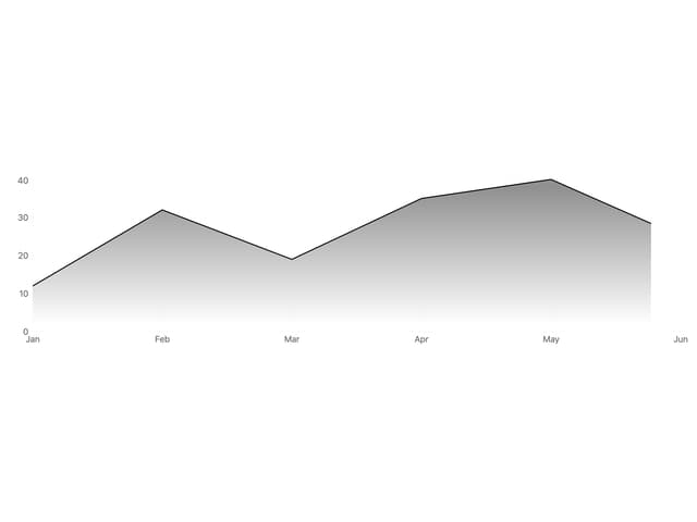
Area Chart
9
Popover
8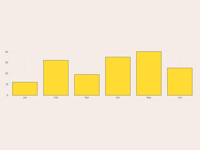
Bar Chart
1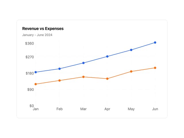
Line Chart
Badge
Tooltip
Toggle Group
More in Navigation
View all

Sidebar
234

Tabs
60
Newsletter Signup Footer
16
Progress Bar Stepper
36

Footer 2
201
Navbar with Theme Toggle
43

Navbar
71

Pagination
86
