About
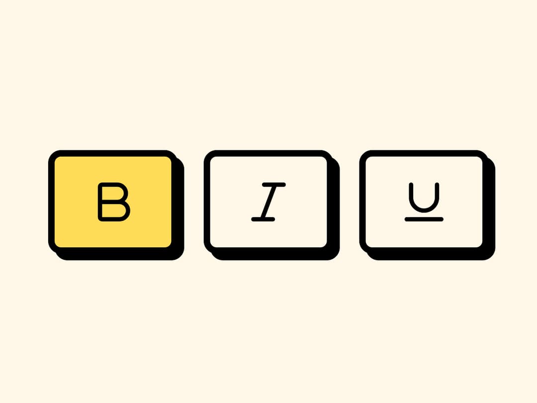
A group of two-state toggle buttons for editor toolbars, view switchers, and filter bars, styled with a neobrutalist border-and-shadow look and built on Base UI.
Built with React and Tailwind. Copy the prompt and paste it into Claude Code, Cursor or Lovable: your agent adds Toggle Group to your project and fits it to your theme.
Code
How Toggle Group is used: the demo's code. The component's own source comes with a free account.
Usage.tsx
import { ToggleGroup, ToggleGroupItem } from "@/components/ui/toggle-group";
import { Bold, Italic, Underline } from "lucide-react";

export default function ToggleGroupDefault() {
  return (
    <ToggleGroup variant="outline" multiple>
      <ToggleGroupItem value="bold" aria-label="Toggle bold">
        <Bold />
      </ToggleGroupItem>
      <ToggleGroupItem value="italic" aria-label="Toggle italic">
        <Italic />
      </ToggleGroupItem>
      <ToggleGroupItem value="underline" aria-label="Toggle underline">
        <Underline />
      </ToggleGroupItem>
    </ToggleGroup>
  );
}
Dependencies
More by retroui
View all

Menu
22
Table
12
Area Chart
9
Popover
8
Bar Chart
1
Line Chart
Badge
Tooltip
More in Buttons
View all
Button Save
46

Button
20

Eclipse Button
5

Button
32

Button
6

Button
14

Button Group
37
Split Button
32

