
About
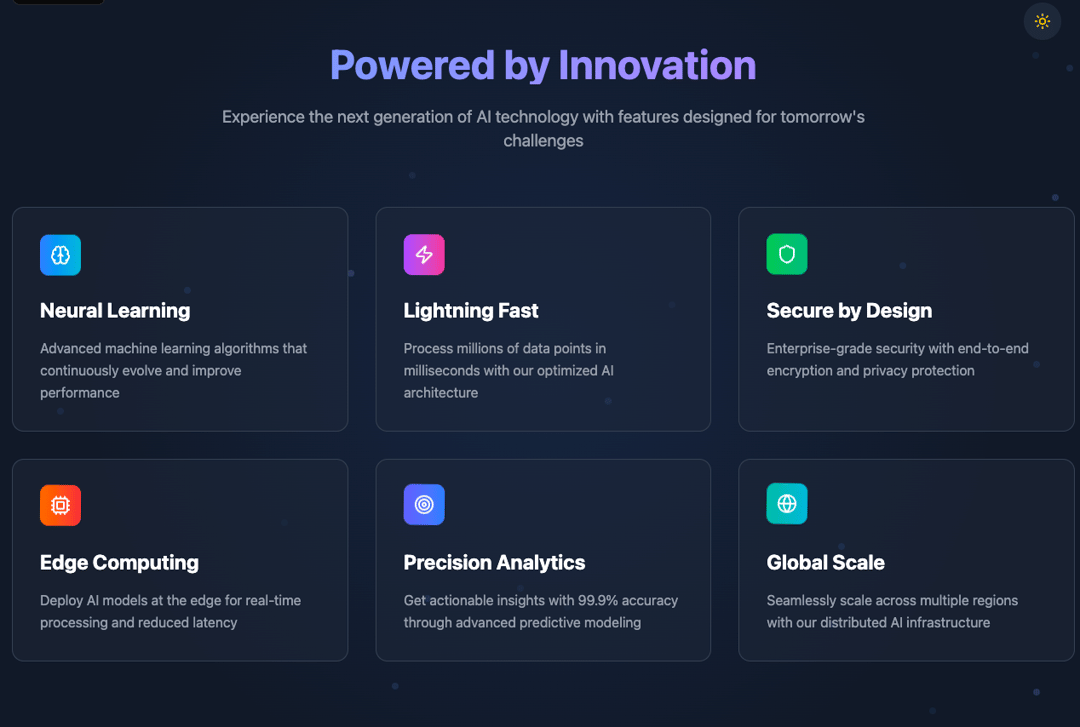
A Features section with animated card section
Built with React and Tailwind. Copy the prompt and paste it into Claude Code, Cursor or Lovable: your agent adds Features to your project and fits it to your theme.
Code
How Features is used: the demo's code. The component's own source comes with a free account.
Usage.tsx
import React, { useState, useEffect } from 'react';
import { Brain, Zap, Shield, Cpu, Target, Globe, Sun, Moon } from 'lucide-react';

const Features = () => {
  const [isDark, setIsDark] = useState(true);

  useEffect(() => {
    // Check system preference
    const prefersDark = window.matchMedia('(prefers-color-scheme: dark)').matches;
    setIsDark(prefersDark);
  }, []);

  const features = [
    {
      icon: Brain,
      title: "Neural Learning",
      description: "Advanced machine learning algorithms that continuously evolve and improve performance",
      color: "from-blue-500 to-cyan-500",
      delay: 0.1
    },
    {
      icon: Zap,
      title: "Lightning Fast",
      description: "Process millions of data points in milliseconds with our optimized AI architecture",
      color: "from-purple-500 to-pink-500",
      delay: 0.2
    },
    {
      icon: Shield,
      title: "Secure by Design",
      description: "Enterprise-grade security with end-to-end encryption and privacy protection",
      color: "from-green-500 to-emerald-500",
      delay: 0.3
    },
    {
      icon: Cpu,
      title: "Edge Computing",
      description: "Deploy AI models at the edge for real-time processing and reduced latency",
      color: "from-orange-500 to-red-500",
      delay: 0.4
    },
    {
      icon: Target,
      title: "Precision Analytics",
      description: "Get actionable insights with 99.9% accuracy through advanced predictive modeling",
      color: "from-indigo-500 to-blue-500",
      delay: 0.5
    },
    {
      icon: Globe,
      title: "Global Scale",
      description: "Seamlessly scale across multiple regions with our distributed AI infrastructure",
      color: "from-teal-500 to-cyan-500",
      delay: 0.6
    }
  ];

  return (
    <section className={`py-20 relative overflow-hidden transition-all duration-700 ${
      isDark
        ? 'bg-gray-900 text-white'
        : 'bg-gradient-to-br from-gray-50 to-blue-50 text-gray-900'
    }`}>
      {/* Background Pattern */}
      <div className={`absolute inset-0 transition-opacity duration-700 ${
        isDark
          ? 'bg-[radial-gradient(circle_at_center,rgba(59,130,246,0.1)_0%,transparent_70%)] opacity-100'
          : 'bg-[radial-gradient(circle_at_center,rgba(59,130,246,0.05)_0%,transparent_70%)] opacity-50'
      }`} />

      {/* Animated Background Elements */}
      <div className="absolute inset-0">
        {[...Array(20)].map((_, i) => (
          <div
            key={i}
            className={`absolute w-2 h-2 rounded-full animate-pulse ${
              isDark ? 'bg-blue-400/20' : 'bg-blue-500/10'
            }`}
            style={{
              left: `${Math.random() * 100}%`,
              top: `${Math.random() * 100}%`,
              animationDelay: `${Math.random() * 3}s`,
              animationDuration: `${2 + Math.random() * 2}s`
            }}
          />
        ))}
      </div>

      {/* Theme Toggle */}
      <div className="absolute top-8 right-8 z-20">
        <button
          onClick={() => setIsDark(!isDark)}
          className={`p-3 rounded-full transition-all duration-300 transform hover:scale-110 ${
            isDark
              ? 'bg-gray-800 hover:bg-gray-700 text-yellow-400'
              : 'bg-white hover:bg-gray-100 text-gray-600 shadow-lg'
          }`}
        >
          {isDark ? <Sun className="w-5 h-5" /> : <Moon className="w-5 h-5" />}
        </button>
      </div>

      <div className="relative z-10 max-w-7xl mx-auto px-4">
        <div className="text-center mb-16">
          <h2 className={`text-4xl md:text-5xl font-bold mb-6 transition-all duration-700 ${
            isDark
              ? 'bg-gradient-to-r from-blue-400 to-purple-400 bg-clip-text text-transparent'
              : 'bg-gradient-to-r from-blue-600 to-purple-600 bg-clip-text text-transparent'
          }`}>
            Powered by Innovation
          </h2>
          <p className={`text-xl max-w-3xl mx-auto transition-colors duration-700 ${
            isDark ? 'text-gray-400' : 'text-gray-600'
          }`}>
            Experience the next generation of AI technology with features designed for tomorrow's challenges
          </p>
        </div>

        <div className="grid grid-cols-1 md:grid-cols-2 lg:grid-cols-3 gap-8">
          {features.map((feature, index) => (
            <div
              key={index}
              className="relative group"
              style={{
                animation: `fadeInUp 0.8s ease-out ${feature.delay}s both`
              }}
            >
              <div className={`relative p-8 rounded-xl h-full transition-all duration-500 transform hover:scale-105 hover:-translate-y-2 ${
                isDark
                  ? 'bg-gray-800/50 backdrop-blur-sm border border-gray-700 hover:border-blue-500/50 hover:shadow-2xl hover:shadow-blue-500/20'
                  : 'bg-white/70 backdrop-blur-sm border border-gray-200 hover:border-blue-400/50 shadow-lg hover:shadow-xl hover:shadow-blue-500/10'
              }`}>
                {/* Animated Background Gradient */}
                <div className={`absolute inset-0 rounded-xl opacity-0 group-hover:opacity-100 transition-opacity duration-500 ${
                  isDark
                    ? 'bg-gradient-to-r from-blue-500/10 to-purple-500/10'
                    : 'bg-gradient-to-r from-blue-500/5 to-purple-500/5'
                }`} />

                {/* Floating Icon */}
                <div
                  className={`inline-flex p-3 rounded-lg bg-gradient-to-r ${feature.color} mb-6 relative z-10`}
                  style={{
                    animation: `float 3s ease-in-out infinite ${feature.delay}s`
                  }}
                >
                  <feature.icon className="w-6 h-6 text-white" />
                </div>

                <h3 className={`text-2xl font-bold mb-4 relative z-10 transition-colors duration-700 ${
                  isDark ? 'text-white' : 'text-gray-900'
                }`}>
                  {feature.title}
                </h3>

                <p className={`leading-relaxed relative z-10 transition-colors duration-700 ${
                  isDark ? 'text-gray-400' : 'text-gray-600'
                }`}>
                  {feature.description}
                </p>

                {/* Shimmer Effect */}
                <div className="absolute inset-0 rounded-xl overflow-hidden">
                  <div className={`absolute top-0 left-0 w-full h-full opacity-0 group-hover:opacity-100 transition-opacity duration-1000 ${
                    isDark
                      ? 'bg-gradient-to-r from-transparent via-white/5 to-transparent'
                      : 'bg-gradient-to-r from-transparent via-blue-500/10 to-transparent'
                  }`}
                  style={{
                    transform: 'translateX(-100%)',
                    animation: 'shimmer 2s infinite'
                  }} />
                </div>
              </div>
            </div>
          ))}
        </div>
      </div>

      <style jsx>{`
        @keyframes fadeInUp {
          from {
            opacity: 0;
            transform: translateY(30px);
          }
          to {
            opacity: 1;
            transform: translateY(0);
          }
        }

        @keyframes float {
          0%, 100% {
            transform: translateY(0px) rotate(0deg);
          }
          50% {
            transform: translateY(-10px) rotate(2deg);
          }
        }

        @keyframes shimmer {
          0% {
            transform: translateX(-100%);
          }
          100% {
            transform: translateX(100%);
          }
        }

        .animate-pulse {
          animation: pulse 2s cubic-bezier(0.4, 0, 0.6, 1) infinite;
        }

        @keyframes pulse {
          0%, 100% {
            opacity: 1;
          }
          50% {
            opacity: 0.3;
          }
        }
      `}</style>
    </section>
  );
};

export default Features;More by MD. RIFADUL ISLAM
View all
UseCases Section

Hero section
More in Features
View all

Features 8
3.1K

Grid Feature Cards
1.9K

Feature Sections
107

Feature 72
123
Features 2
322
Feature Modern
9
Features 4
368
Features Card
201

