
About
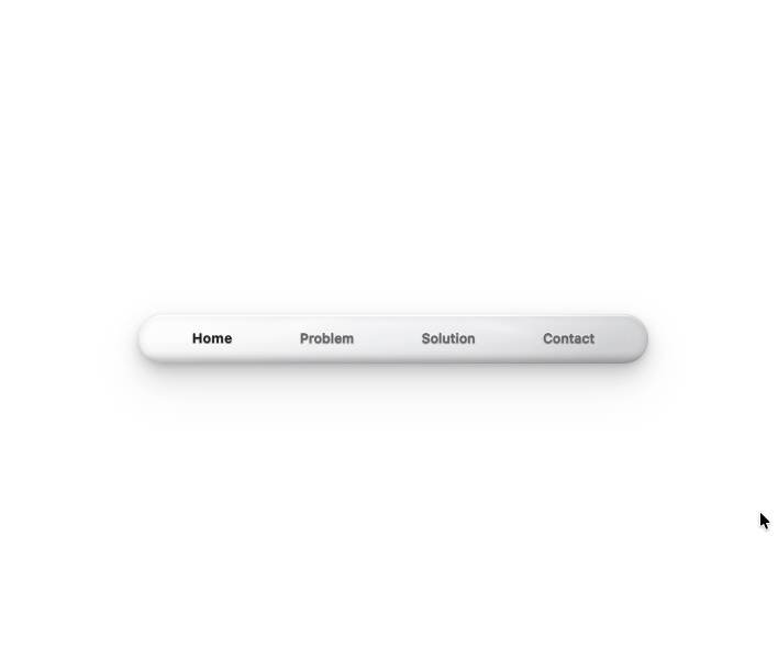
A stunning 3D navigation component with ultra-realistic depth, lighting, and material effects. Features: • Premium 3D design with photorealistic shadows and gradients • Smooth hover-to-expand interaction with staggered animations • Click-to-select behavior with automatic collapse • Elegant text transitions with subtle lighting pulses • Fully responsive and optimized for modern web apps • Built with React, TypeScript, and Framer Motion
Built with React and Tailwind. Copy the prompt and paste it into Claude Code, Cursor or Lovable: your agent adds 3D Adaptive Navigation Bar to your project and fits it to your theme.
Code
How 3D Adaptive Navigation Bar is used: the demo's code. The component's own source comes with a free account.
Usage.tsx
import { PillBase } from '@/components/ui/3d-adaptive-navigation-bar'

/**
 * Demo file - Default export is required
 * This is what users and moderators see in preview
 */
export default function Demo() {
  return (
    <div
      style={{
        background: '#ffffff',
        minHeight: '100vh',
        display: 'flex',
        alignItems: 'center',
        justifyContent: 'center',
      }}
    >
      <PillBase />
    </div>
  )
}
Dependencies
More by Om
View all

Cinematic Theme Switcher
592
Project-reveal
1
Comet Hero Section
1