

About
Built with React and Tailwind. Copy the prompt and paste it into Claude Code, Cursor or Lovable: your agent adds Cinematic Theme Switcher to your project and fits it to your theme.
Code
How Cinematic Theme Switcher is used: the demo's code. The component's own source comes with a free account.
Usage.tsx
'use client';

import Component from '@/components/ui/cinematic-theme-switcher';

export default function Demo() {
  return (
    <div className="min-h-screen w-full bg-white dark:bg-[#1d1e1f] transition-colors duration-700 ease-in-out">
      <div className="flex min-h-screen items-center justify-center transition-colors duration-700 ease-in-out">
        <Component />
      </div>
    </div>
  );
}
Dependencies
More by Om
View all

3D Adaptive Navigation Bar
495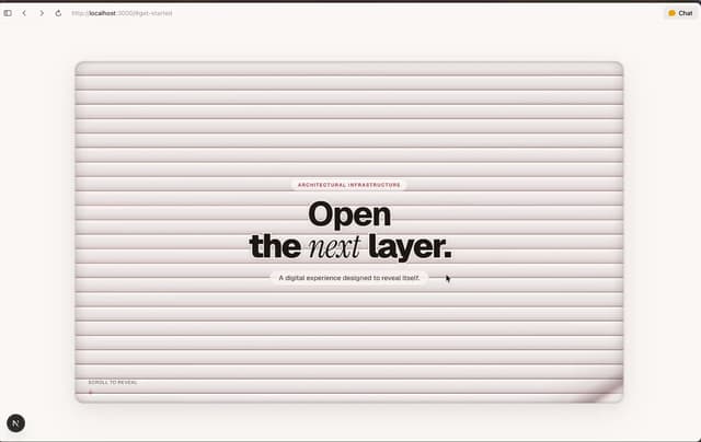
Project-reveal
1
Comet Hero Section
1