
About
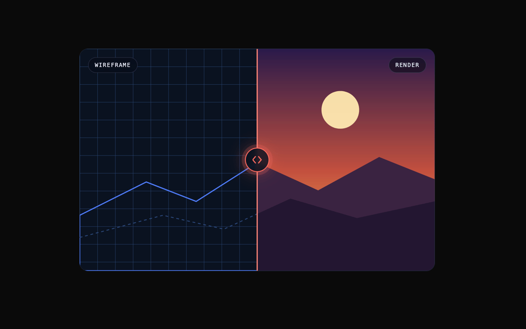
A before/after comparison slider with a draggable handle, keyboard control and an intro sweep — double-click to snap back to centre.
Built with React and Tailwind. Copy the prompt and paste it into Claude Code, Cursor or Lovable: your agent adds Compare Reveal to your project and fits it to your theme.
Code
How Compare Reveal is used: the demo's code. The component's own source comes with a free account.
Usage.tsx
"use client";

import { CompareReveal } from "@/components/ui/compare-reveal";

/* Both sides are inline SVG rather than <img>: a published component has to render
   on a host whose CSP blocks every external origin, so no remote asset can load.
   Side captions come from the `labels` prop — don't also draw them in the scene. */

const Wireframe = (
  <div className="relative h-full w-full bg-[#0b1220]">
    <svg viewBox="0 0 640 400" preserveAspectRatio="xMidYMid slice" className="h-full w-full">
      <defs>
        <pattern id="cr-grid" width="32" height="32" patternUnits="userSpaceOnUse">
          <path d="M32 0H0v32" fill="none" stroke="#2b4a7a" strokeWidth="1" />
        </pattern>
      </defs>
      <rect width="640" height="400" fill="url(#cr-grid)" />
      <path d="M0 300 L120 240 L210 275 L320 205 L430 255 L540 195 L640 235 V400 H0Z" fill="none" stroke="#4f7cff" strokeWidth="2" />
      <path d="M0 340 L150 300 L260 325 L380 270 L500 305 L640 275" fill="none" stroke="#2b4a7a" strokeWidth="1.5" strokeDasharray="5 5" />
      <circle cx="470" cy="110" r="34" fill="none" stroke="#4f7cff" strokeWidth="2" strokeDasharray="4 6" />
    </svg>
  </div>
);

const Render = (
  <div className="relative h-full w-full">
    <svg viewBox="0 0 640 400" preserveAspectRatio="xMidYMid slice" className="h-full w-full">
      <defs>
        <linearGradient id="cr-sky" x1="0" y1="0" x2="0" y2="1">
          <stop offset="0%" stopColor="#2a1a4a" />
          <stop offset="55%" stopColor="#c2503f" />
          <stop offset="100%" stopColor="#f6b94a" />
        </linearGradient>
      </defs>
      <rect width="640" height="400" fill="url(#cr-sky)" />
      <circle cx="470" cy="110" r="34" fill="#ffe9b0" opacity="0.95" />
      <path d="M0 300 L120 240 L210 275 L320 205 L430 255 L540 195 L640 235 V400 H0Z" fill="#3a2340" />
      <path d="M0 340 L150 300 L260 325 L380 270 L500 305 L640 275 V400 H0Z" fill="#231630" />
    </svg>
  </div>
);

export default function CompareRevealDemo() {
  return (
    <div className="flex w-full items-center justify-center p-10">
      <CompareReveal
        className="w-full max-w-2xl overflow-hidden rounded-2xl border border-[var(--motiq-border)]"
        style={{ aspectRatio: "16 / 10" }}
        before={Wireframe}
        after={Render}
        labels={["Wireframe", "Render"]}
        defaultPosition={50}
        introSweep
        snapOnDoubleClick={50}
      />
    </div>
  );
}
Dependencies
More by Mehi
View all
Border Beam Panel
929
Decrypt Text
240
Holo Card
220
Magnetic Dock
157
Luminous Topography
106
Lens Card
83
Copperplate Hatch
59
Animated Grid
49