
About
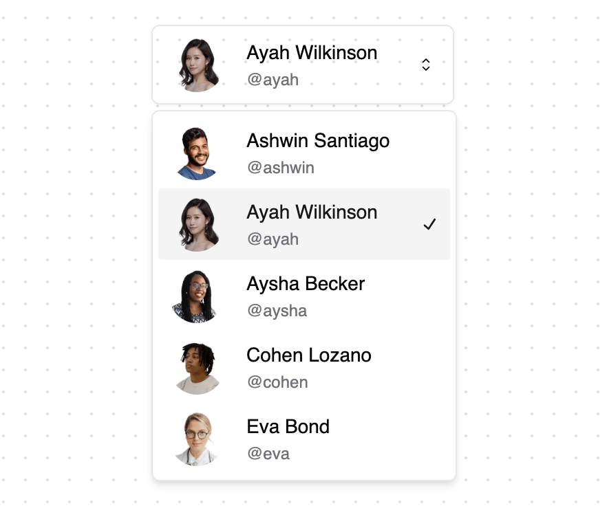
A dropdown select component built on top of Radix UI Select primitive. Supports multiple variants, icons, and custom styling. Features - Multiple variants (default, filled, flushed, dashed) - Custom trigger icons - Error state handling - Helper text support - Scrollable content - Custom item indicators - Keyboard navigation - Accessible by default - Customizable animations - Dark mode compatible
Built with React and Tailwind. Copy the prompt and paste it into Claude Code, Cursor or Lovable: your agent adds Extended Select to your project and fits it to your theme.
Code
How Extended Select is used: the demo's code. The component's own source comes with a free account.
Usage.tsx
"use client"

import { Dot } from "lucide-react"
import Image from "next/image"
import {
  Select,
  SelectContent,
  SelectItem,
  SelectTrigger,
  SelectValue,
} from "@/components/ui/select"

const statuses = [
  { value: "completed", label: "Completed", color: "text-emerald-600" },
  { value: "in_progress", label: "In Progress", color: "text-blue-600" },
  { value: "pending", label: "Pending", color: "text-yellow-500" },
  { value: "cancelled", label: "Cancelled", color: "text-gray-500" },
  { value: "failed", label: "Failed", color: "text-red-600" },
]

const users = [
  {
    value: "user1",
    name: "Ashwin Santiago",
    twitter: "@ashwin",
    avatar: "https://www.extend-ui.com/_next/image?url=https%3A%2F%2Futfs.io%2Fa%2F9g3kf9djq5%2F7zmIwBk1GZeszEPB1RoL5yfeTt9QHciEpvWZO4oNRYd78gD2&w=96&q=75"
  },
  {
    value: "user2",
    name: "Ayah Wilkinson",
    twitter: "@ayah",
    avatar: "https://www.extend-ui.com/_next/image?url=https%3A%2F%2Futfs.io%2Fa%2F9g3kf9djq5%2F7zmIwBk1GZesAAlqU8cspq73uNyl4bVzMtmeFr9dP51Hoc0i&w=96&q=75"
  },
  {
    value: "user3",
    name: "Aysha Becker",
    twitter: "@aysha",
    avatar: "https://www.extend-ui.com/_next/image?url=https%3A%2F%2Futfs.io%2Fa%2F9g3kf9djq5%2F7zmIwBk1GZesEDGVq92T4LXqJAzvb7Bay16kxN2DWoKGQE3F&w=96&q=75"
  },
  {
    value: "user4",
    name: "Cohen Lozano",
    twitter: "@cohen",
    avatar: "https://www.extend-ui.com/_next/image?url=https%3A%2F%2Futfs.io%2Fa%2F9g3kf9djq5%2F7zmIwBk1GZesU6WYdiu1UYlV8Zmqcfr9Xg3HOeKGBTb5ChDs&w=96&q=75"
  },
  {
    value: "user5",
    name: "Eva Bond",
    twitter: "@eva",
    avatar: "https://www.extend-ui.com/_next/image?url=https%3A%2F%2Futfs.io%2Fa%2F9g3kf9djq5%2F7zmIwBk1GZesW8VypWhRzfYdH1K9vlanbirG4AehCwZBk62j&w=96&q=75"
  }
]

function StatusSelectDemo() {
  return (
    <div className="space-y-2">
      <Select defaultValue="completed">
        <SelectTrigger id="select-status" className="w-[180px]">
          <SelectValue placeholder="Select status" />
        </SelectTrigger>
        <SelectContent>
          {statuses.map((status) => (
            <SelectItem
              key={status.value}
              value={status.value}
              className="focus:bg-accent focus:text-accent-foreground"
            >
              <span className="flex items-center gap-2">
                <Dot
                  className={status.color}
                  width={10}
                  height={10}
                  strokeWidth={20}
                />
                <span className="truncate">{status.label}</span>
              </span>
            </SelectItem>
          ))}
        </SelectContent>
      </Select>
    </div>
  )
}

function AvatarSelectDemo() {
  return (
    <div className="space-y-2">
      <Select defaultValue={users[0]?.value}>
        <SelectTrigger id="select-user" className="h-full w-[220px]">
          <SelectValue placeholder="Select user" />
        </SelectTrigger>
        <SelectContent>
          {users.map((user) => (
            <SelectItem
              key={user.value}
              value={user.value}
              className="focus:bg-accent focus:text-accent-foreground"
            >
              <span className="flex items-center gap-4">
                <Image
                  className="rounded-full"
                  src={user.avatar}
                  alt={user.name}
                  width={40}
                  height={40}
                />
                <span className="flex flex-col items-start">
                  <span className="font-medium">{user.name}</span>
                  <span className="mt-0.5 block text-xs text-muted-foreground">
                    {user.twitter}
                  </span>
                </span>
              </span>
            </SelectItem>
          ))}
        </SelectContent>
      </Select>
    </div>
  )
}

export { StatusSelectDemo, AvatarSelectDemo }
Dependencies
More by ExtendUI
View all
Notification Alert Dialog
109
3D Card
94
Credit Card
91
Alert Dialog Icon
67
Error Alert Dialog
33
More in Forms
View all

Premium Auth
500

Login 2
7
Authentication Card
47

Login 1
52

Contact Card
1K
Login Form
6

Form
16

Book A Demo 3
83
