
About
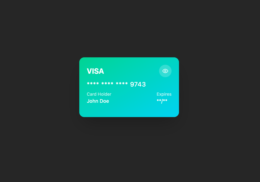
Here is 3D Card component
Built with React and Tailwind. Copy the prompt and paste it into Claude Code, Cursor or Lovable: your agent adds 3D Card to your project and fits it to your theme.
Code
How 3D Card is used: the demo's code. The component's own source comes with a free account.
Usage.tsx
import { Component } from '@/components/ui/3d-card-1';

const DemoCreditCard = () => {
  return (
    <div className="flex w-full h-screen justify-center items-center bg-muted">
      <Component />
    </div>
  );
};

export default DemoCreditCard;
Dependencies
More by ExtendUI
View all
Notification Alert Dialog
109
Credit Card
91
Alert Dialog Icon
67
Error Alert Dialog
33
Extended Select
32
More in Cards
View all

Course Design Cards
1.1K
Stats cards with links
79

Statistics Card 2
259
Card
56

Card Studio
9
The Item one
3
Statistics Card 7
289

Weather Card
54
