
About
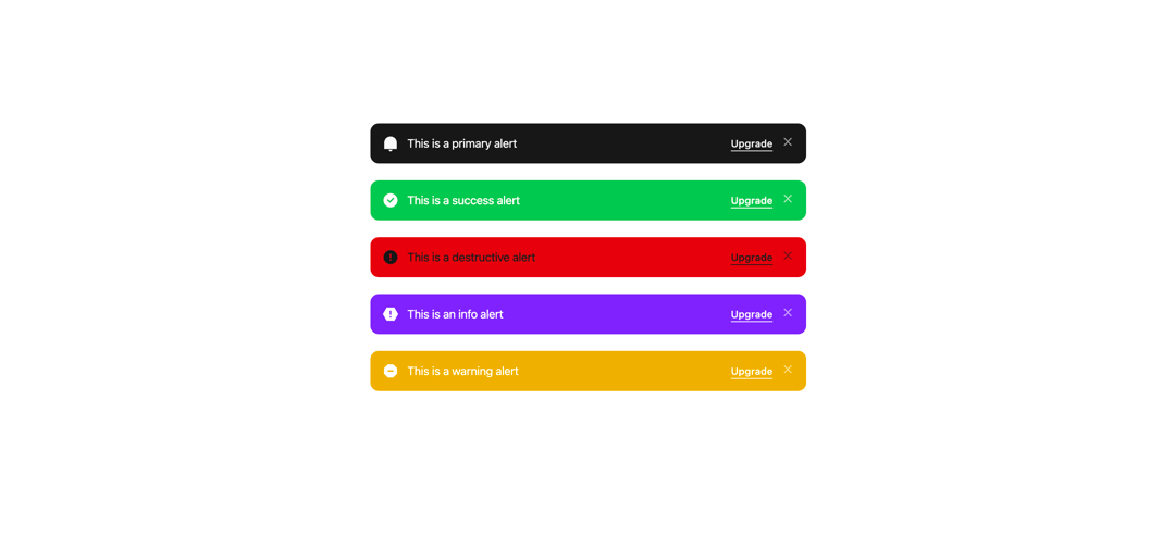
Displays a callout for user attention, such as a success message, warning, or error.
Built with React and Tailwind. Copy the prompt and paste it into Claude Code, Cursor or Lovable: your agent adds Alert to your project and fits it to your theme.
Code
How Alert is used: the demo's code. The component's own source comes with a free account.
Usage.tsx
import {
  Alert,
  AlertIcon,
  AlertTitle,
  AlertToolbar,
} from '@/components/ui/alert';
import { Button } from '@/components/ui/button';
import {
  RiCheckboxCircleFill,
  RiErrorWarningFill,
  RiNotificationFill,
  RiSpam3Fill,
  RiSpamFill,
} from '@remixicon/react';

const DemoOne = () => {
  return (
    <div className="flex flex-col gap-5 p-10 w-full mx-auto max-w-[600px] h-screen justify-center items-center">
      <Alert variant="primary" close={true}>
        <AlertIcon>
          <RiNotificationFill />
        </AlertIcon>
        <AlertTitle>This is a primary alert</AlertTitle>
        <AlertToolbar>
          <Button
            variant="inverse"
            mode="link"
            underlined="solid"
            size="sm"
            className="flex mt-0.5"
          >
            Upgrade
          </Button>
        </AlertToolbar>
      </Alert>
      <Alert variant="success" close={true}>
        <AlertIcon>
          <RiCheckboxCircleFill />
        </AlertIcon>
        <AlertTitle>This is a success alert</AlertTitle>
        <AlertToolbar>
          <Button
            variant="inverse"
            mode="link"
            underlined="solid"
            size="sm"
            className="flex mt-0.5"
          >
            Upgrade
          </Button>
        </AlertToolbar>
      </Alert>
      <Alert variant="destructive" close={true}>
        <AlertIcon>
          <RiErrorWarningFill />
        </AlertIcon>
        <AlertTitle>This is a destructive alert</AlertTitle>
        <AlertToolbar>
          <Button
            variant="inverse"
            mode="link"
            underlined="solid"
            size="sm"
            className="flex mt-0.5"
          >
            Upgrade
          </Button>
        </AlertToolbar>
      </Alert>
      <Alert variant="info" close={true}>
        <AlertIcon>
          <RiSpamFill />
        </AlertIcon>
        <AlertTitle>This is an info alert</AlertTitle>
        <AlertToolbar>
          <Button
            variant="inverse"
            mode="link"
            underlined="solid"
            size="sm"
            className="flex mt-0.5"
          >
            Upgrade
          </Button>
        </AlertToolbar>
      </Alert>
      <Alert variant="warning" close={true}>
        <AlertIcon>
          <RiSpam3Fill />
        </AlertIcon>
        <AlertTitle>This is a warning alert</AlertTitle>
        <AlertToolbar>
          <Button
            variant="inverse"
            mode="link"
            underlined="solid"
            size="sm"
            className="flex mt-0.5"
          >
            Upgrade
          </Button>
        </AlertToolbar>
      </Alert>
    </div>
  );
};

export { DemoOne };
Dependencies
More by Sean Hello
View all

3D Testimonails
3.3K
Line Charts 9
637
Alert
492
Area Charts 1
385
Line Charts 6
384
Scroll Area
376
Area Charts 2
317
Navigation Menu
305