
About
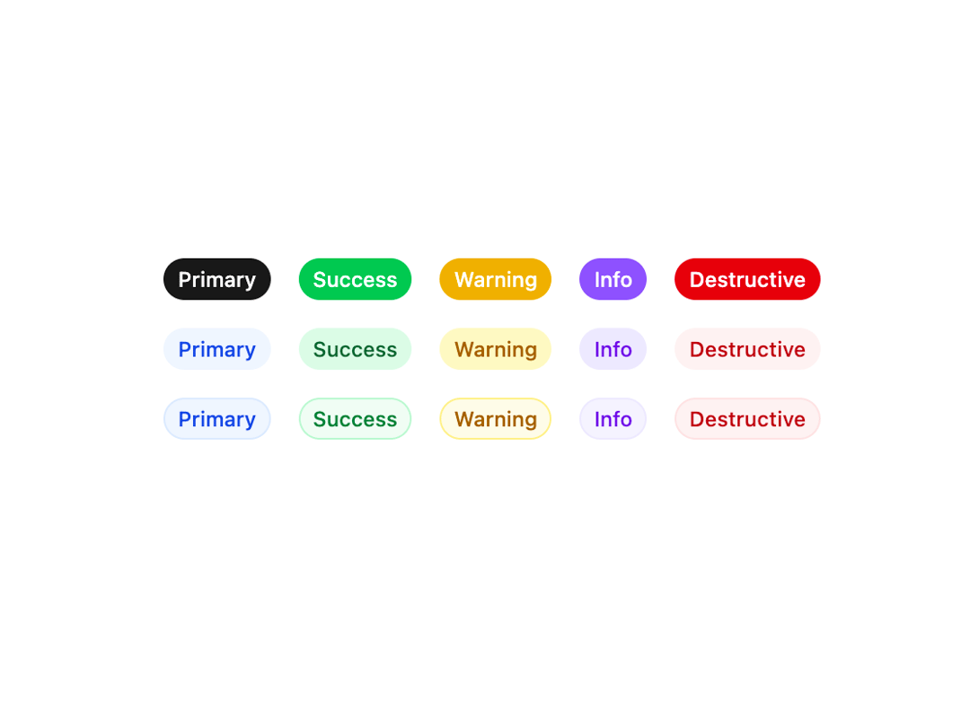
A Badge is a small, visually distinct element used to display contextual metadata, such as status, category, or notifications, enhancing the clarity and organization of your design.
Built with React and Tailwind. Copy the prompt and paste it into Claude Code, Cursor or Lovable: your agent adds Badge to your project and fits it to your theme.
Code
How Badge is used: the demo's code. The component's own source comes with a free account.
Usage.tsx
import { Badge } from '@/components/ui/badge-2';

export default function Component() {
  return (
    <div className="flex flex-col items-center gap-4">
      <div className="flex items-center gap-4">
        <Badge variant="primary" shape="circle">
          Primary
        </Badge>
        <Badge variant="success" shape="circle">
          Success
        </Badge>
        <Badge variant="warning" shape="circle">
          Warning
        </Badge>
        <Badge variant="info" shape="circle">
          Info
        </Badge>
        <Badge variant="destructive" shape="circle">
          Destructive
        </Badge>
      </div>
      <div className="flex items-center gap-4">
        <Badge variant="primary" appearance="light" shape="circle">
          Primary
        </Badge>
        <Badge variant="success" appearance="light" shape="circle">
          Success
        </Badge>
        <Badge variant="warning" appearance="light" shape="circle">
          Warning
        </Badge>
        <Badge variant="info" appearance="light" shape="circle">
          Info
        </Badge>
        <Badge variant="destructive" appearance="light" shape="circle">
          Destructive
        </Badge>
      </div>
      <div className="flex items-center gap-4">
        <Badge variant="primary" appearance="outline" shape="circle">
          Primary
        </Badge>
        <Badge variant="success" appearance="outline" shape="circle">
          Success
        </Badge>
        <Badge variant="warning" appearance="outline" shape="circle">
          Warning
        </Badge>
        <Badge variant="info" appearance="outline" shape="circle">
          Info
        </Badge>
        <Badge variant="destructive" appearance="outline" shape="circle">
          Destructive
        </Badge>
      </div>
    </div>
  );
}
Dependencies
More by Sean Hello
View all

3D Testimonails
3.3K
Line Charts 9
637
Alert
492
Area Charts 1
385
Line Charts 6
384
Scroll Area
376
Area Charts 2
317
Navigation Menu
305