
About
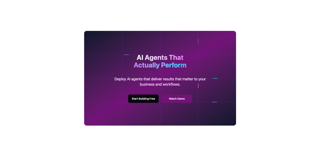
A responsive grid background with animated moving beams.
Built with React and Tailwind. Copy the prompt and paste it into Claude Code, Cursor or Lovable: your agent adds Beam Grid Hero to your project and fits it to your theme.
Code
How Beam Grid Hero is used: the demo's code. The component's own source comes with a free account.
Usage.tsx
'use client';

import { Button } from '@/components/ui/button';
import { GridBackground } from '@/components/ui/beam-grid-hero';

export default function DemoOne() {
  return (
      <div className="mx-10 relative h-[500px] w-full max-w-[800px] rounded-xl overflow-hidden">
        <GridBackground
          gridSize="4:4"
          colors={{
            background: 'bg-gradient-to-br from-slate-900 via-fuchsia-900 to-slate-900',
            borderColor: 'border-purple-500/20',
            borderSize: '1px',
            borderStyle: 'solid',
          }}
          beams={{
            count: 8,
            colors: ['bg-purple-400', 'bg-indigo-400', 'bg-cyan-400', 'bg-violet-400', 'bg-fuchsia-400'],
            speed: 5,
            shadow: 'shadow-lg shadow-current/60',
          }}
        >
          {/* Content */}
          <div className="flex flex-col items-center justify-center max-w-4xl mx-auto space-y-10 h-full px-8">
            {/* Main heading */}
            <h1 className="text-center text-3xl md:text-4xl font-bold bg-gradient-to-r from-white via-purple-200 to-fuchsia-400 bg-clip-text text-transparent animate-fade-in">
              AI Agents That
              <br />
              <span className="bg-gradient-to-r from-purple-400 to-cyan-400 bg-clip-text text-transparent">
                Actually Perform
              </span>
            </h1>

            {/* Subtitle */}
            <p className="text-center text-xl text-purple-100 max-w-lg mx-auto animate-fade-in">
              Deploy AI agents that deliver results that matter to your business and workflows.
            </p>

            {/* CTA buttons */}
            <div className="flex flex-col sm:flex-row gap-4 justify-center animate-fade-in">
              <Button
                size="lg"
                variant="ghost"
                className="bg-zinc-950 hover:bg-zinc-950 text-white hover:text-white hover:shadow-lg hover:shadow-fuchsia-950 w-40"
              >
                Start Building Free
              </Button>
              <Button
                size="lg"
                variant="ghost"
                className="bg-fuchsia-900 hover:bg-fuchsia-900 text-white hover:text-white hover:shadow-lg hover:shadow-fuchsia-950 w-40"
              >
                Watch Demo
              </Button>
            </div>
          </div>
        </GridBackground>
      </div>
  );
}
Dependencies
More by Sean Hello
View all

3D Testimonails
3.3K
Line Charts 9
637
Alert
492
Area Charts 1
385
Line Charts 6
384
Scroll Area
376
Area Charts 2
317
Navigation Menu
305
More in Heroes
View all

SaaS Template
2.4K
Centered Hero with Image Fan
930

Hero
1.2K

Responsive Hero Banner
2K

Minimalist Hero Fashion
285

Hero Section 6
881

Home Section
66
Hero Golden Spiral
101
