
About
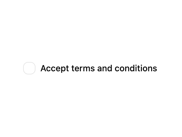
A control that allows the user to toggle between checked and not checked.
Built with React and Tailwind. Copy the prompt and paste it into Claude Code, Cursor or Lovable: your agent adds Checkbox to your project and fits it to your theme.
Code
How Checkbox is used: the demo's code. The component's own source comes with a free account.
Usage.tsx
'use client';

import { useId } from 'react';
import { Checkbox } from '@/components/ui/checkbox-1';
import { Label } from '@/components/ui/label';

export default function CheckboxDemo() {
  const id = useId();

  return (
    <div className="flex items-center space-x-2">
      <Checkbox id={id} />
      <Label htmlFor={id}>Accept terms and conditions</Label>
    </div>
  );
}
Dependencies
More by Sean Hello
View all

3D Testimonails
3.3K
Line Charts 9
636
Alert
492
Area Charts 1
385
Line Charts 6
384
Scroll Area
376
Area Charts 2
317
Navigation Menu
305
More in Forms
View all

Premium Auth
499

Login 2
7
Authentication Card
46

Login 1
52

Contact Card
1K
Login Form
6

Form
16

Form
136
