
About
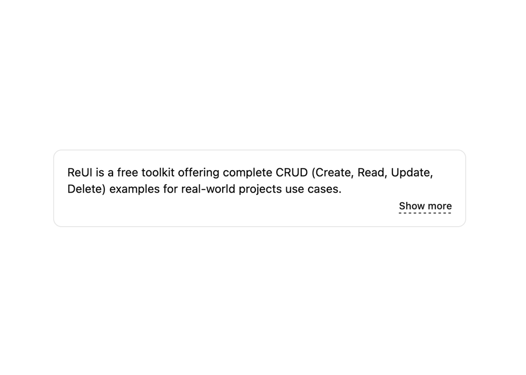
An interactive component that expands/collapses a panel.
Built with React and Tailwind. Copy the prompt and paste it into Claude Code, Cursor or Lovable: your agent adds Collapsible to your project and fits it to your theme.
Code
How Collapsible is used: the demo's code. The component's own source comes with a free account.
Usage.tsx
'use client';

import * as React from 'react';
import { Button } from '@/components/ui/button-1';
import { Collapsible, CollapsibleContent, CollapsibleTrigger } from '@/components/ui/collapsible';

export default function CollapsibleDemo() {
  const [isOpen, setIsOpen] = React.useState(false);

  return (
    <div className="w-[500px] text-foreground text-sm rounded-lg border border-border p-4">
      ReUI is a free toolkit offering complete CRUD (Create, Read, Update, Delete) examples for real-world projects use
      cases.
      <Collapsible open={isOpen} onOpenChange={setIsOpen}>
        <CollapsibleContent>
          Unlike libraries that address specific parts of CRUD, ReUI delivers end-to-end solutions, making it an
          essential tool for building the core functionality of any application.
        </CollapsibleContent>

        <div className="text-end">
          <CollapsibleTrigger asChild>
            <Button underlined="dashed" mode="link" size="sm">
              {isOpen ? 'Show less' : 'Show more'}
            </Button>
          </CollapsibleTrigger>
        </div>
      </Collapsible>
    </div>
  );
}
Dependencies
More by Sean Hello
View all

3D Testimonails
3.3K
Line Charts 9
637
Alert
492
Area Charts 1
385
Line Charts 6
384
Scroll Area
376
Area Charts 2
317
Navigation Menu
305