
About
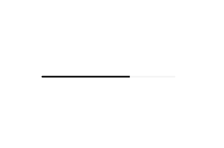
Displays an indicator showing the completion progress of a task, typically displayed as a progress bar.
Built with React and Tailwind. Copy the prompt and paste it into Claude Code, Cursor or Lovable: your agent adds Progress to your project and fits it to your theme.
Code
How Progress is used: the demo's code. The component's own source comes with a free account.
Usage.tsx
'use client';

import * as React from 'react';
import { Progress } from '@/components/ui/progress';

export default function Component() {
  const [progress, setProgress] = React.useState(13);

  React.useEffect(() => {
    const timer = setTimeout(() => setProgress(66), 500);
    return () => clearTimeout(timer);
  }, []);

  return (
    <div className="w-full max-w-md">
      <Progress value={progress} />
    </div>
  );
}
Dependencies
More by Sean Hello
View all

3D Testimonails
3.3K
Line Charts 9
632
Alert
492
Area Charts 1
384
Line Charts 6
383
Scroll Area
376
Area Charts 2
316
Navigation Menu
305