
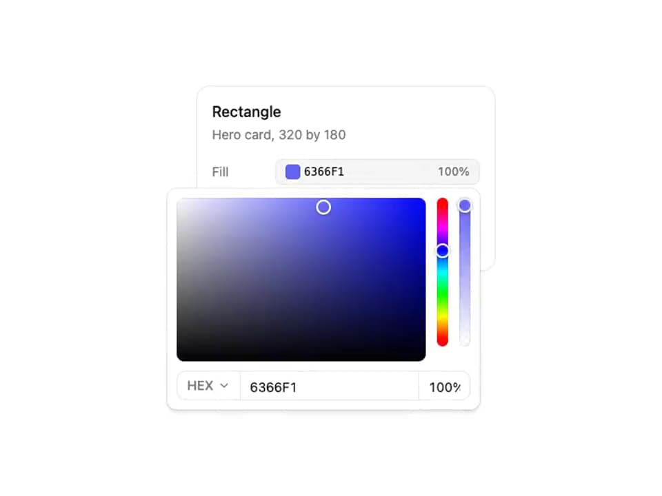
About
Fill, stroke and shadow rows that open a compact picker with vertical hue and opacity tracks.
Built with React and Tailwind. Copy the prompt and paste it into Claude Code, Cursor or Lovable: your agent adds ReUI color picker - Design inspector to your project and fits it to your theme.
Code
How ReUI color picker - Design inspector is used: the demo's code. The component's own source comes with a free account.
Usage.tsx
"use client";
import Component from "@/components/ui/reui-color-picker-12";
import {ThemeProvider} from "next-themes";
export default function LibraryRegistryPreview(){const theme=typeof window!=="undefined"&&new URLSearchParams(window.location.search).get("theme")==="light"?"light":"dark";return <ThemeProvider defaultTheme={theme} enableSystem={false}><div data-component-demo data-theme={theme} className={theme+" style-nova"}><div><Component/></div></div></ThemeProvider>}
Dependencies
More by Sean Hello
View all

3D Testimonails
3.3K
Line Charts 9
637
Alert
492
Area Charts 1
385
Line Charts 6
384
Scroll Area
376
Area Charts 2
317
Navigation Menu
306