
About
ReUI Input Group with the first 10 official ReUI examples, preserved from the MIT-licensed source registry.
Built with React and Tailwind. Copy the prompt and paste it into Claude Code, Cursor or Lovable: your agent adds ReUI Input Group to your project and fits it to your theme.
Code
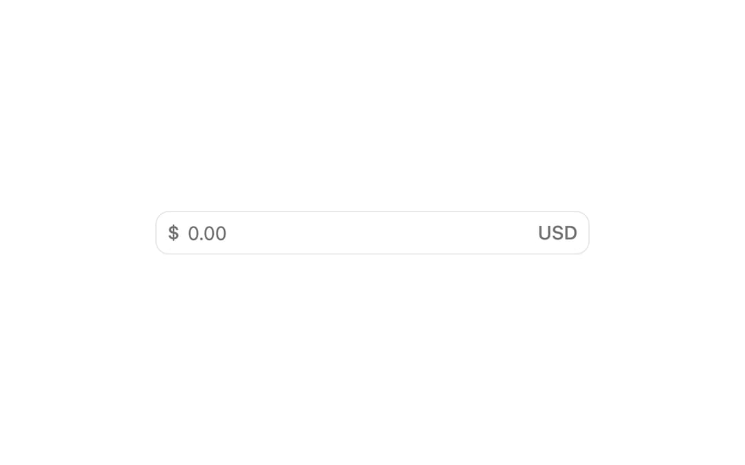
How ReUI Input Group is used: the demo's code. The component's own source comes with a free account.
Usage.tsx
import { Field } from "@/components/ui/reui-input-group-utils/field"
import {
  InputGroup,
  InputGroupAddon,
  InputGroupInput,
  InputGroupText,
} from "@/components/ui/reui-input-group"

export default function Pattern() {
  return (
    <Field className="w-full max-w-xs">
      <InputGroup>
        <InputGroupAddon>
          <InputGroupText>$</InputGroupText>
        </InputGroupAddon>
        <InputGroupInput type="number" placeholder="0.00" />
        <InputGroupAddon align="inline-end">
          <InputGroupText>USD</InputGroupText>
        </InputGroupAddon>
      </InputGroup>
    </Field>
  )
}
Dependencies
More by Sean Hello
View all

3D Testimonails
3.3K
Line Charts 9
630
Alert
492
Area Charts 1
384
Line Charts 6
382
Scroll Area
376
Area Charts 2
316
Navigation Menu
305