
About
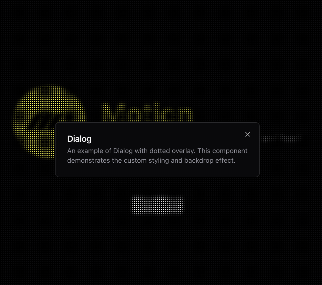
A customized dialog component based on shadcn/ui Dialog with a dotted background pattern inspired by Motion.dev website. Features: • Dotted background pattern with blur effect • Dark/light theme support • Fully accessible (based on Radix UI) • Smooth animations for open and close states • Responsive design • Includes all standard dialog components (header, footer, title, description)
Built with React and Tailwind. Copy the prompt and paste it into Claude Code, Cursor or Lovable: your agent adds Dotted Dialog to your project and fits it to your theme.
Code
How Dotted Dialog is used: the demo's code. The component's own source comes with a free account.
Usage.tsx
"use client"

import { Button } from "@/components/ui/button"
import { Dialog, DialogContent, DialogDescription, DialogFooter, DialogHeader, DialogTitle, DialogTrigger } from "@/components/ui/dotted-dialog"

const MotionLogo = ({ className, color = "fill-yellow-300" }: { className?: string, color?: string }) => (
  <svg
    xmlns="http://www.w3.org/2000/svg"
    className={className}
    viewBox="0 0 905 317"
  >
    <path
      d="M341.711 0L162.9 316.721H0l139.623-247.308C161.267 31.077 215.278 0 260.261 0zm399.477 79.18c0-43.73 36.466-79.18 80.95-79.18 44.984 0 81.45 35.45 81.45 79.18 0 43.73-36.466 79.18-81.45 79.18-44.484 0-80.95-35.45-80.95-79.18zM372.255 0h162.9L356.344 316.721H193.444L372.255 0zm192.398 0h162.902L587.93 247.307c-21.643 38.337-75.655 69.414-120.638 69.414h-81.45L564.653 0z"
      className={color}
    />
  </svg>
)

export function DottedDialogDemo() {
  return (
    <div className="relative min-h-[500px] w-full">
      <header className="fixed top-0 left-0 right-0 z-50 p-4 flex items-center justify-between">
        <div className="flex items-center gap-4">
          <MotionLogo className="w-[32px] h-[32px]" />
        </div>
        <nav className="flex gap-6 text-sm font-medium">
          <a href="#" className="hover:text-gray-300">Docs</a>
          <a href="#" className="hover:text-gray-300">Examples</a>
          <a href="#" className="hover:text-gray-300">Motion+</a>
        </nav>
      </header>

      <div className="flex flex-col items-center justify-center min-h-[500px] gap-10">
        <div className="flex items-center gap-8 mb-10">
          <div className="w-[150px] h-[150px] rounded-full bg-yellow-300 flex items-center justify-center">
            <MotionLogo className="w-[100px] h-[100px]" color="fill-black" />
          </div>
          <div className="flex flex-col gap-2">
            <h1 className="text-yellow-300 text-6xl font-bold">Motion</h1>
            <p className="text-lg">
              A modern animation library for JavaScript and React
            </p>
          </div>
        </div>

        <Dialog>
          <DialogTrigger asChild>
            <Button size="sm">Open Dialog</Button>
          </DialogTrigger>
          <DialogContent className="sm:max-w-[425px]">
            <DialogHeader>
              <DialogTitle>Dialog</DialogTitle>
              <DialogDescription>
                An example of Dialog with dotted overlay. This component demonstrates
                the custom styling and backdrop effect.
              </DialogDescription>
            </DialogHeader>
          </DialogContent>
        </Dialog>
      </div>
    </div>
  )
}
Dependencies
More by Serafim
View all
Spline Scene
9.4K
Testimonials with Marquee
2.3K
Gradient Button
1.9K
Pixel Canvas
899
Animated Blur Number
830
Empty State
774
Balloons
755
Status Badge
642
More in Heroes
View all

SaaS Template
2.4K

Hero
1.2K

Responsive Hero Banner
2K
Centered Hero with Image Fan
920

HeroSectionWithGradient
334
Editorial Collage Hero
425

Hero 03
314
Glass Fold
197
