
About
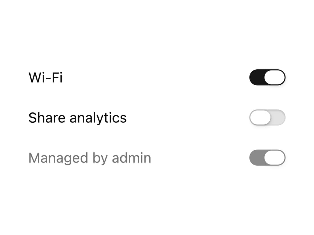
Compact Base UI switch with a sliding gradient track and spring-eased thumb, for toggling a single setting on or off.
Built with React and Tailwind. Copy the prompt and paste it into Claude Code, Cursor or Lovable: your agent adds Switch to your project and fits it to your theme.
Code
How Switch is used: the demo's code. The component's own source comes with a free account.
Usage.tsx
"use client"

import * as React from "react"

import { Switch } from "@/components/ui/switch"

export default function SwitchDemo() {
  const [wifi, setWifi] = React.useState(true)
  const [analytics, setAnalytics] = React.useState(false)

  return (
    <div className="flex w-full max-w-xs flex-col gap-5 p-8">
      <div className="flex items-center justify-between gap-6">
        <span className="text-sm text-foreground">Wi-Fi</span>
        <Switch checked={wifi} onCheckedChange={setWifi} />
      </div>
      <div className="flex items-center justify-between gap-6">
        <span className="text-sm text-foreground">Share analytics</span>
        <Switch checked={analytics} onCheckedChange={setAnalytics} />
      </div>
      <div className="flex items-center justify-between gap-6">
        <span className="text-sm text-muted-foreground">Managed by admin</span>
        <Switch checked disabled />
      </div>
    </div>
  )
}
Dependencies
More by Serafim
View all
Spline Scene
9.5K
Testimonials with Marquee
2.3K
Gradient Button
1.9K
Pixel Canvas
900
Animated Blur Number
830
Empty State
775
Balloons
755
Status Badge
646