About
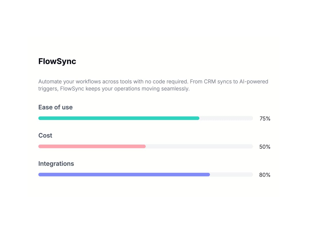
A progress bar component for transactional and marketing emails, with single, grouped, and two-column layouts and optional title/description text.
Built with React and Tailwind. Copy the prompt and paste it into Claude Code, Cursor or Lovable: your agent adds Email Progress Bar to your project and fits it to your theme.
Code
How Email Progress Bar is used: the demo's code. The component's own source comes with a free account.
Usage.tsx
import Progress from "@/components/ui/jsx-email-progress";

const settings = {
  layout: "group" as const,
  padding: "none" as const,
  content: "text-top" as const,
};

export default function Demo(props: Partial<typeof settings>) {
  const s = { ...settings, ...props };
  return (
    <div className="w-full max-w-xl mx-auto">
      <Progress layout={s.layout} padding={s.padding} content={s.content} />
    </div>
  );
}
More by shadcn-labs
View all

Coupons With Centered Text
Stripe Receipt Email
Masonry Product Detail
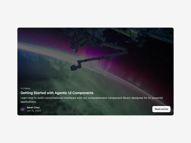
Post Card

Post List
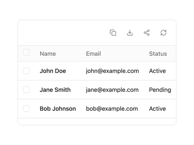
Data Table
Message Bubble
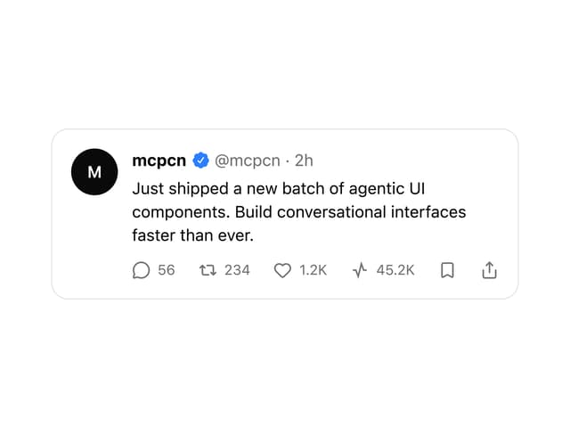
X Post Card