
About
A composable social media post card that mimics an X (Twitter) post, with avatar, header (name, handle, verified badge, timestamp), text content, and engagement metrics (replies, reposts, likes, views, bookmark, share).
Built with React and Tailwind. Copy the prompt and paste it into Claude Code, Cursor or Lovable: your agent adds X Post Card to your project and fits it to your theme.
Code
How X Post Card is used: the demo's code. The component's own source comes with a free account.
Usage.tsx
import {
  XPost,
  XPostActions,
  XPostAvatar,
  XPostContent,
  XPostHeader,
  XPostText,
} from "@/components/ui/x-post";

export default function XPostDemo() {
  return (
    <div className="flex w-full max-w-md items-center justify-center p-6">
      <XPost>
        <div className="flex gap-3">
          <XPostAvatar />
          <XPostContent>
            <XPostHeader />
            <XPostText />
            <XPostActions />
          </XPostContent>
        </div>
      </XPost>
    </div>
  );
}
Dependencies
More by shadcn-labs
View all

Email Progress Bar
3
Coupons With Centered Text
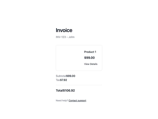
Stripe Receipt Email
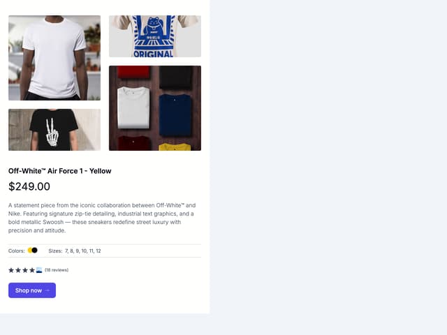
Masonry Product Detail

Post Card

Post List
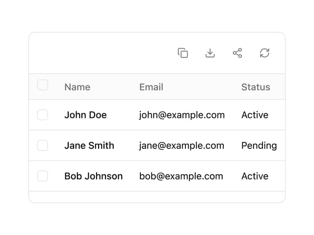
Data Table

Message Bubble
More in Cards
View all
Stats cards with links
120

Course Design Cards
1.1K

Statistics Card 2
258
Card
55

Card Studio
9
Statistics Card 7
288
The Item one
3

Weather Card
52
